



Lotta Nieminen
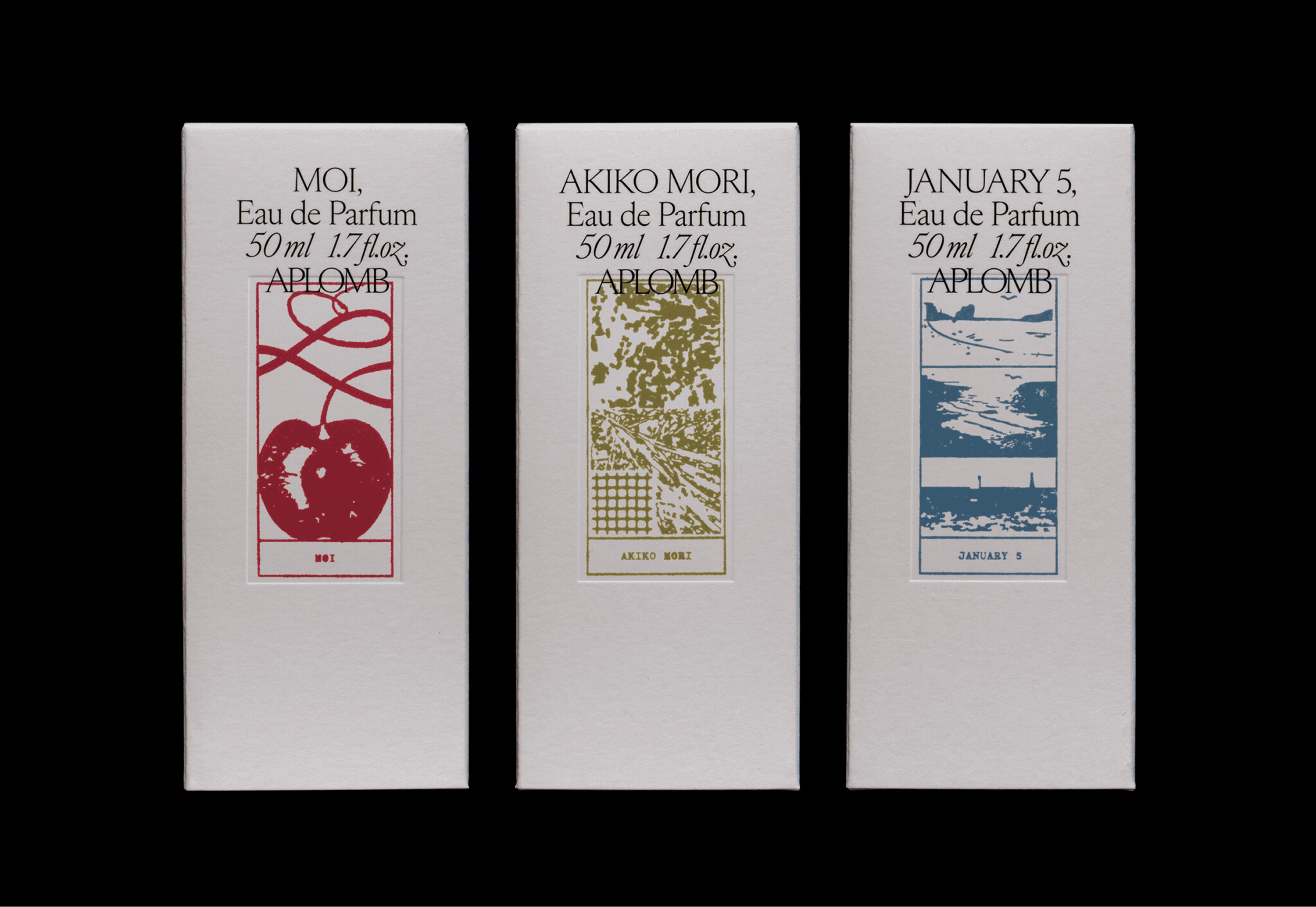
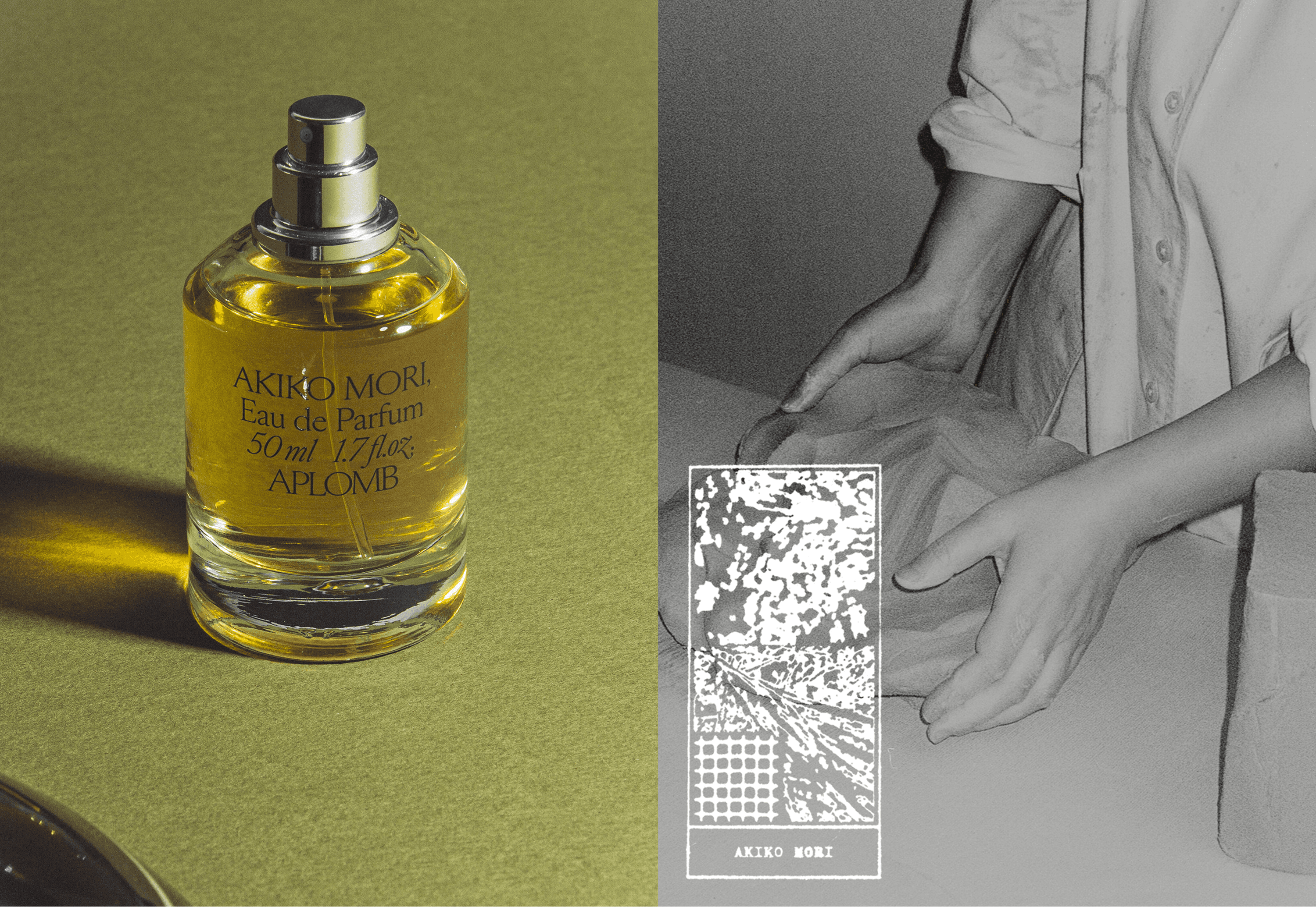
Lotta Nieminen developed the brand identity for Aplomb, a high-end perfume brand where each fragrance is conceived as a letter addressed to the person who inspired it. That idea, the letter, runs through the entire system. The identity draws on the intimacy of writing and the tactility of fine stationery, balancing craftsmanship with clarity.
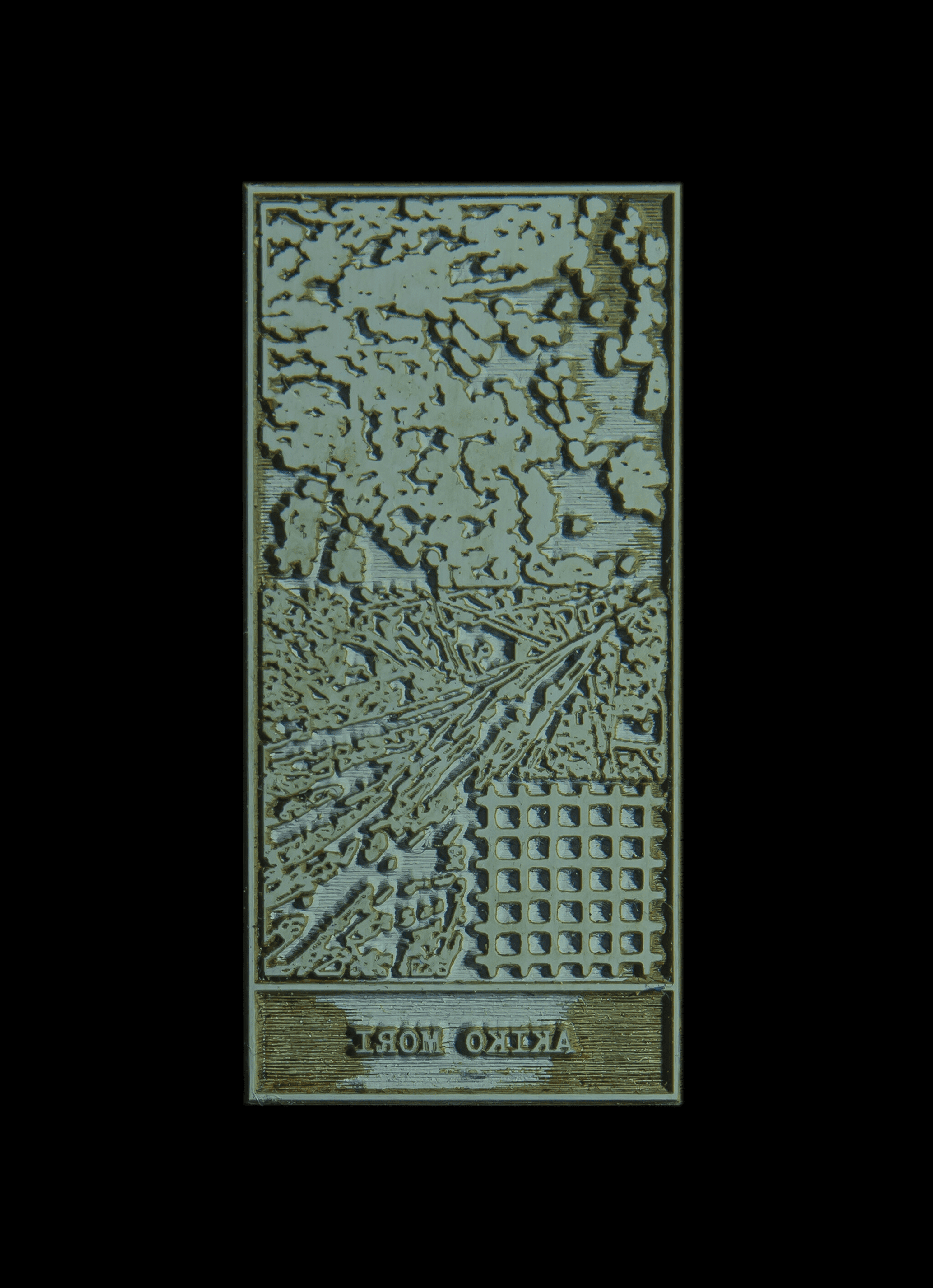
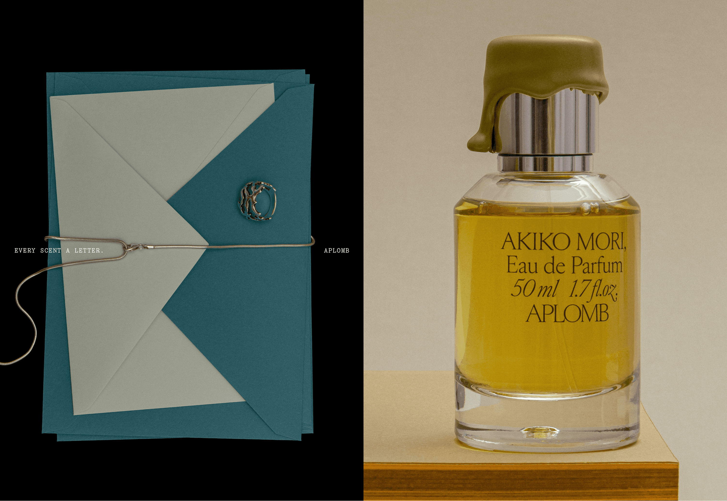
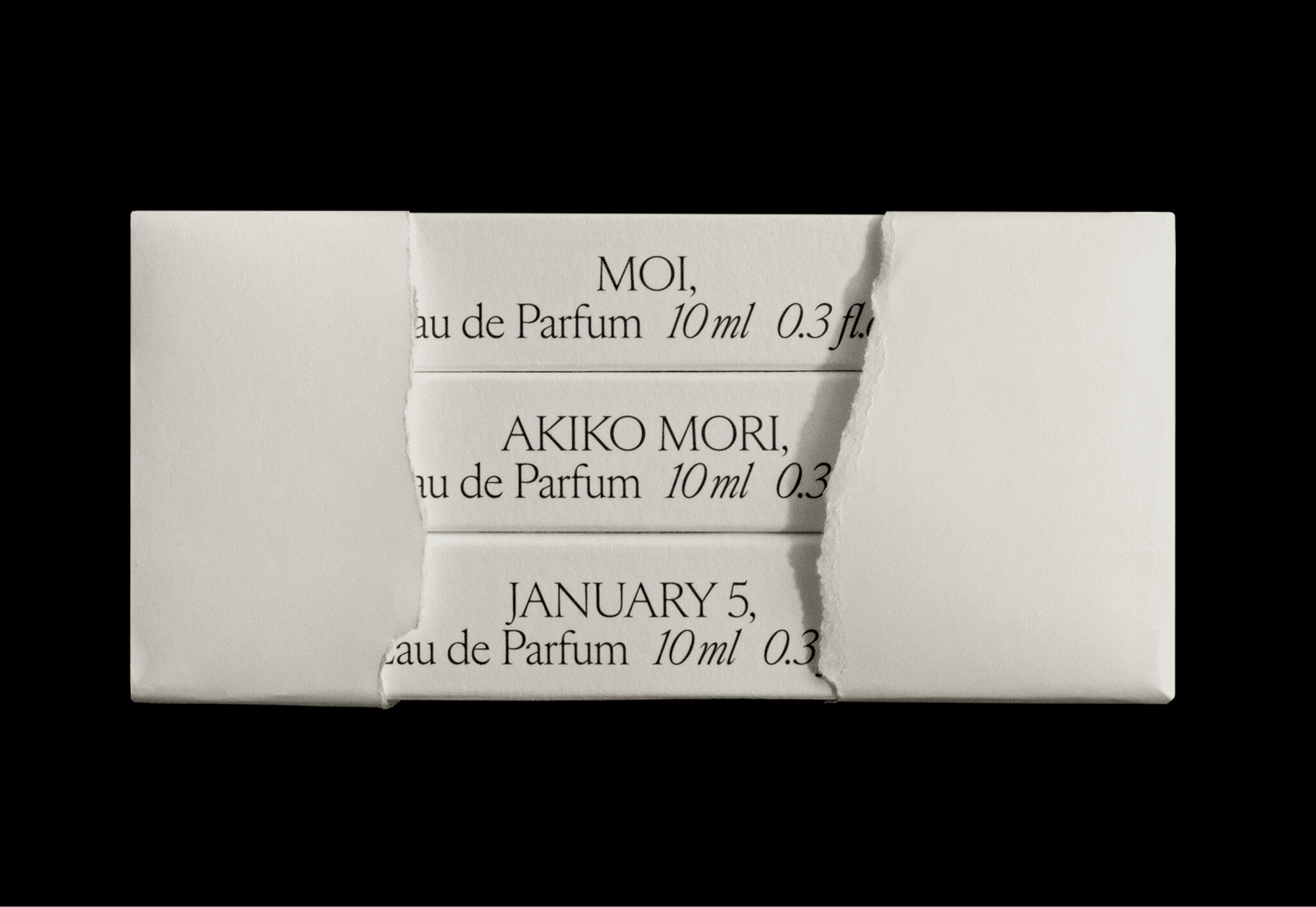
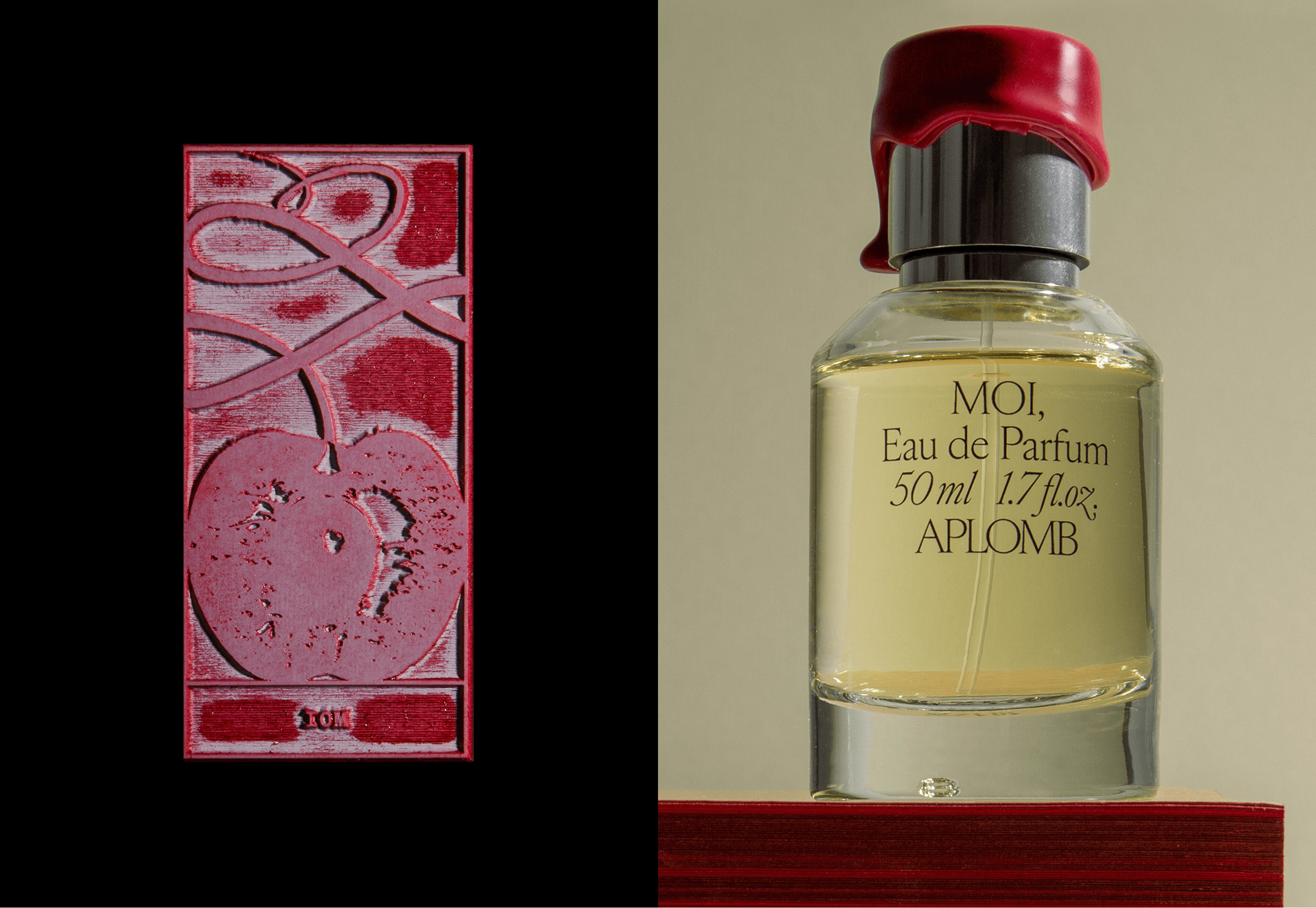
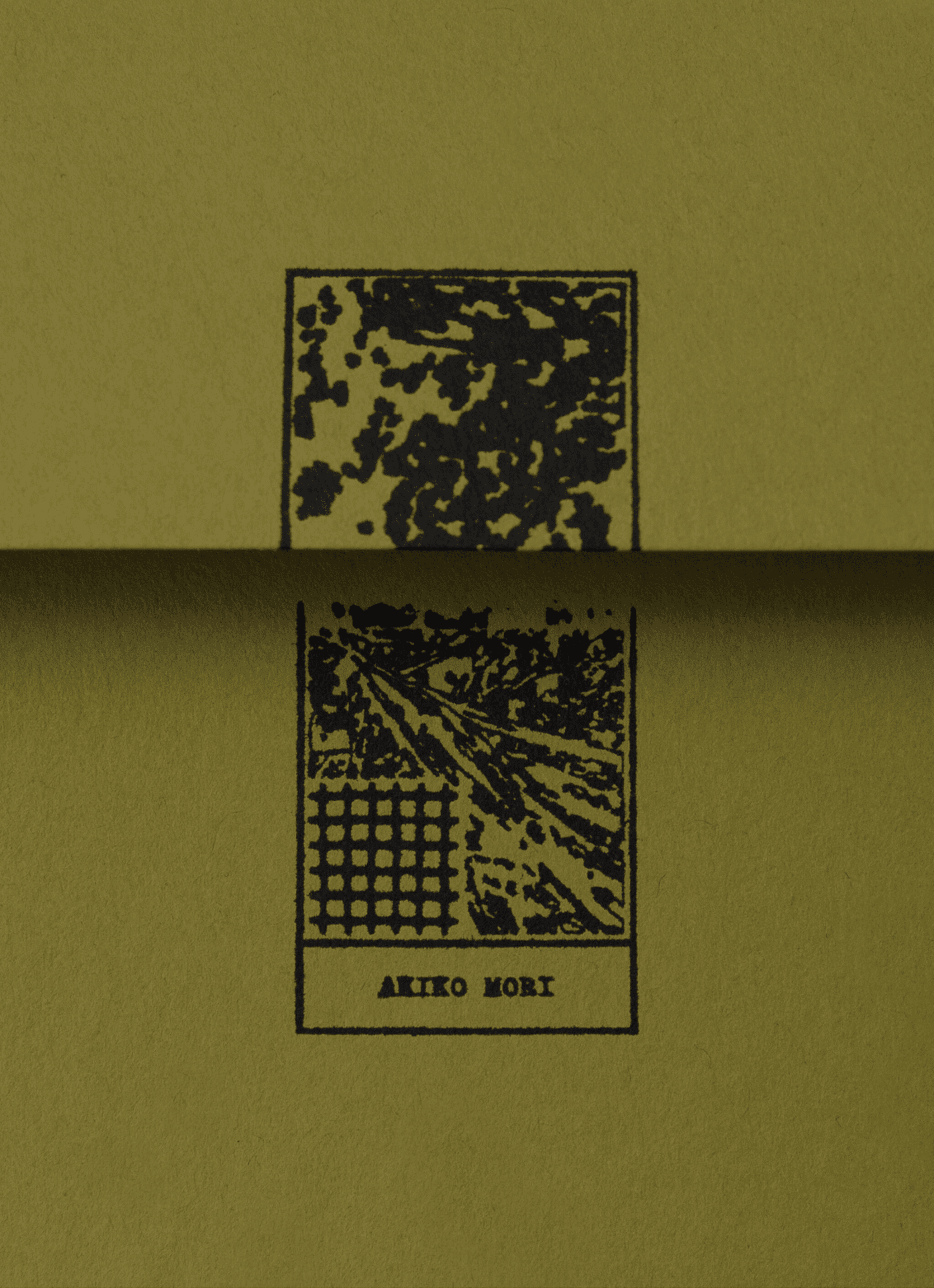
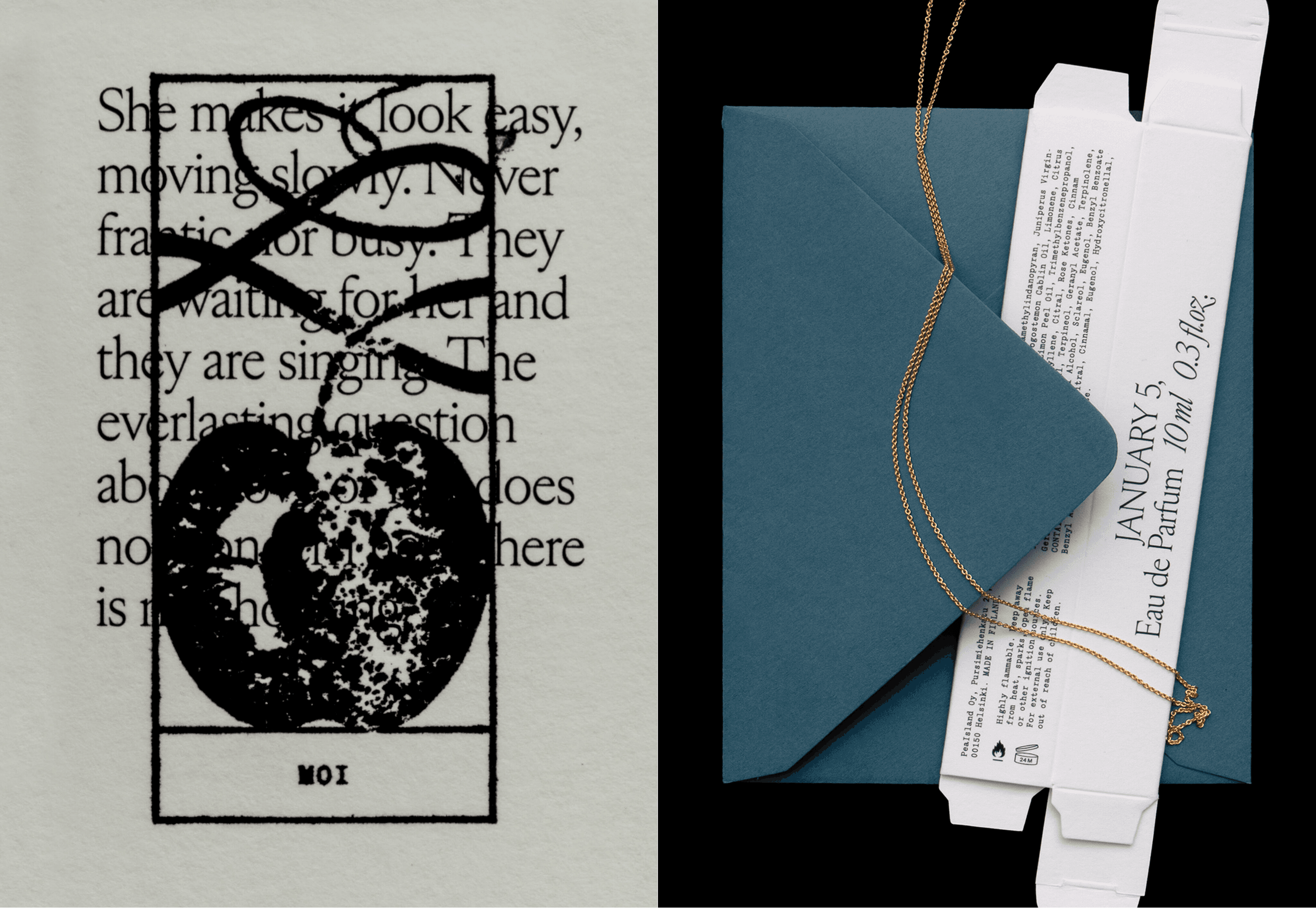
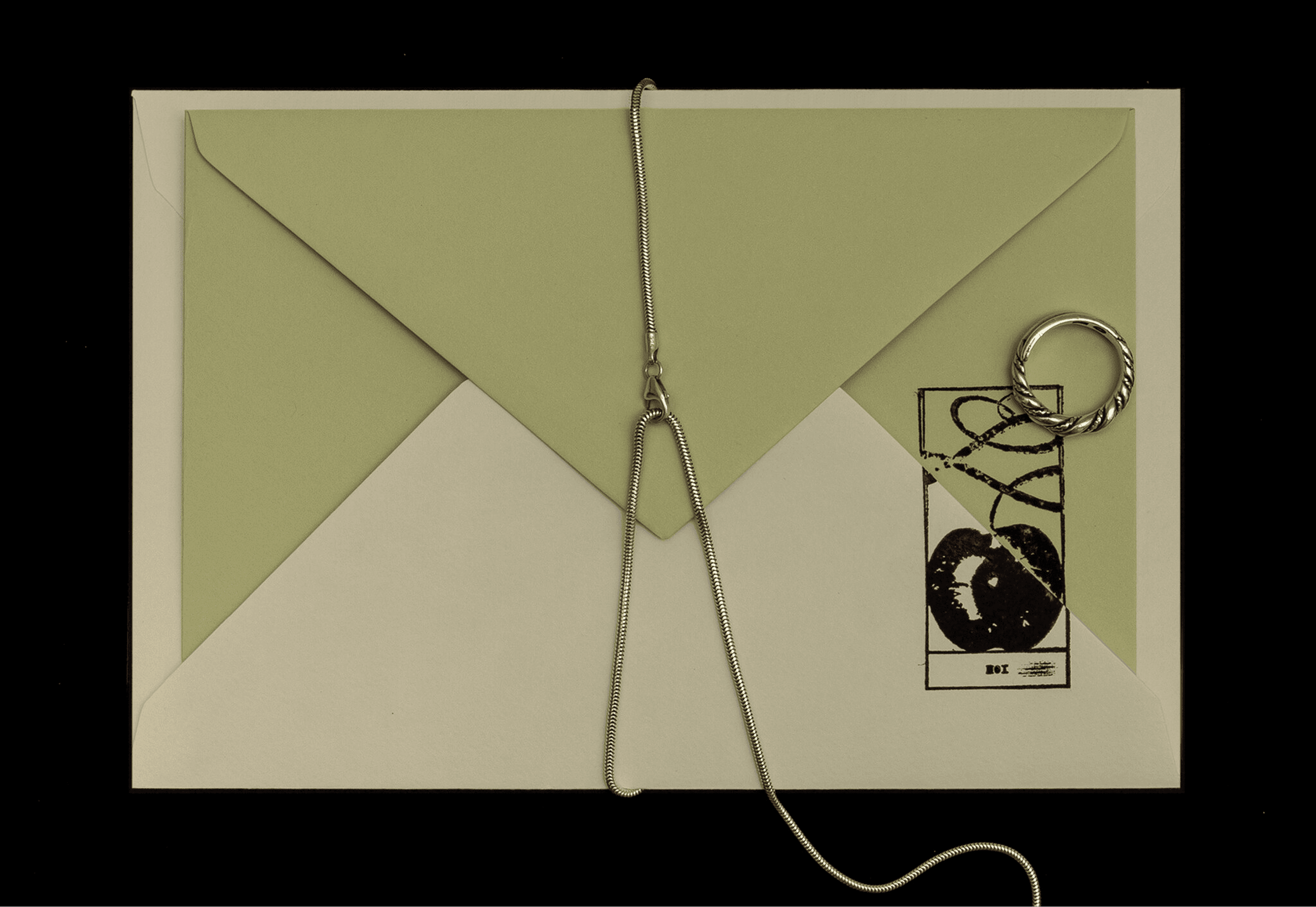
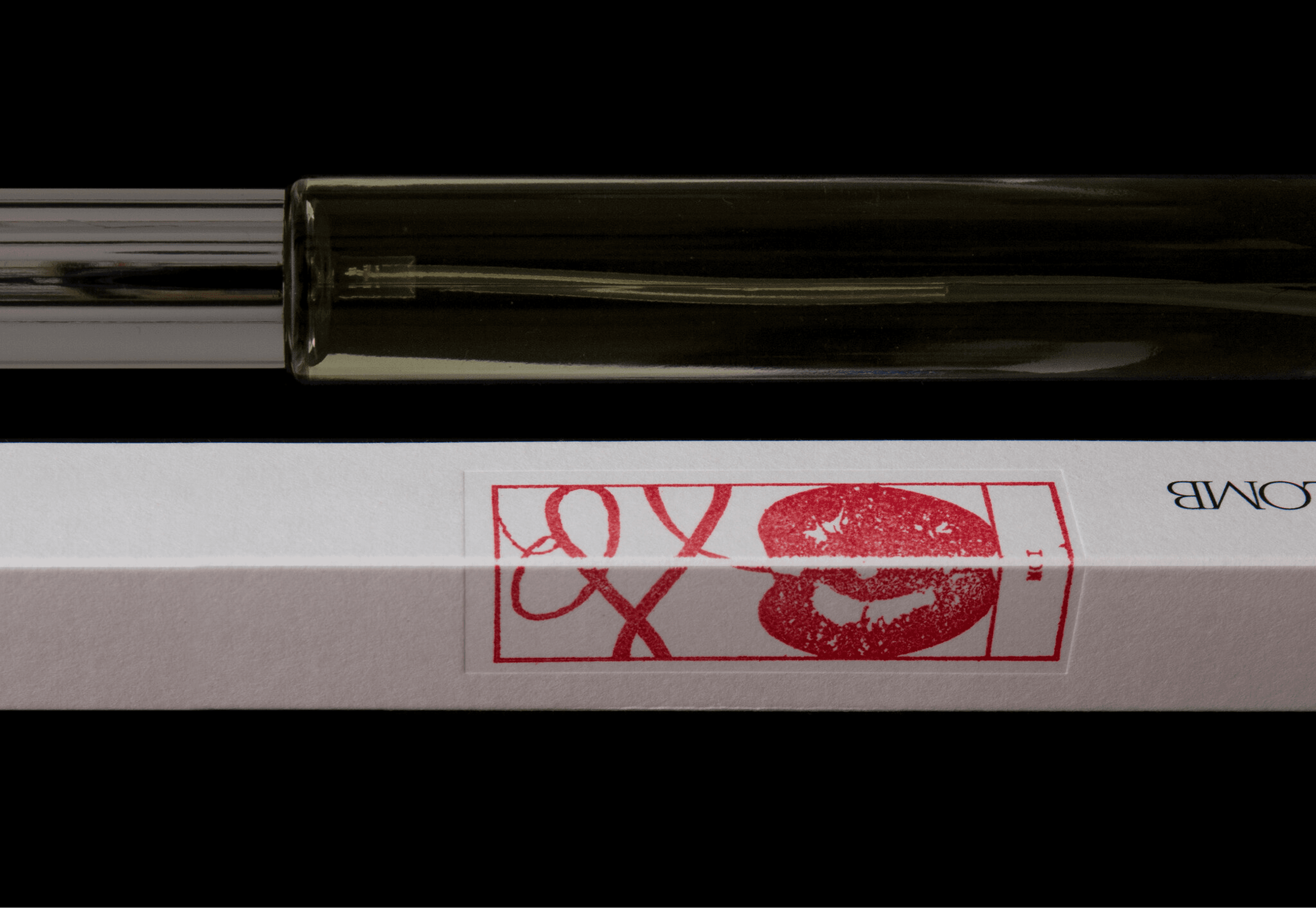
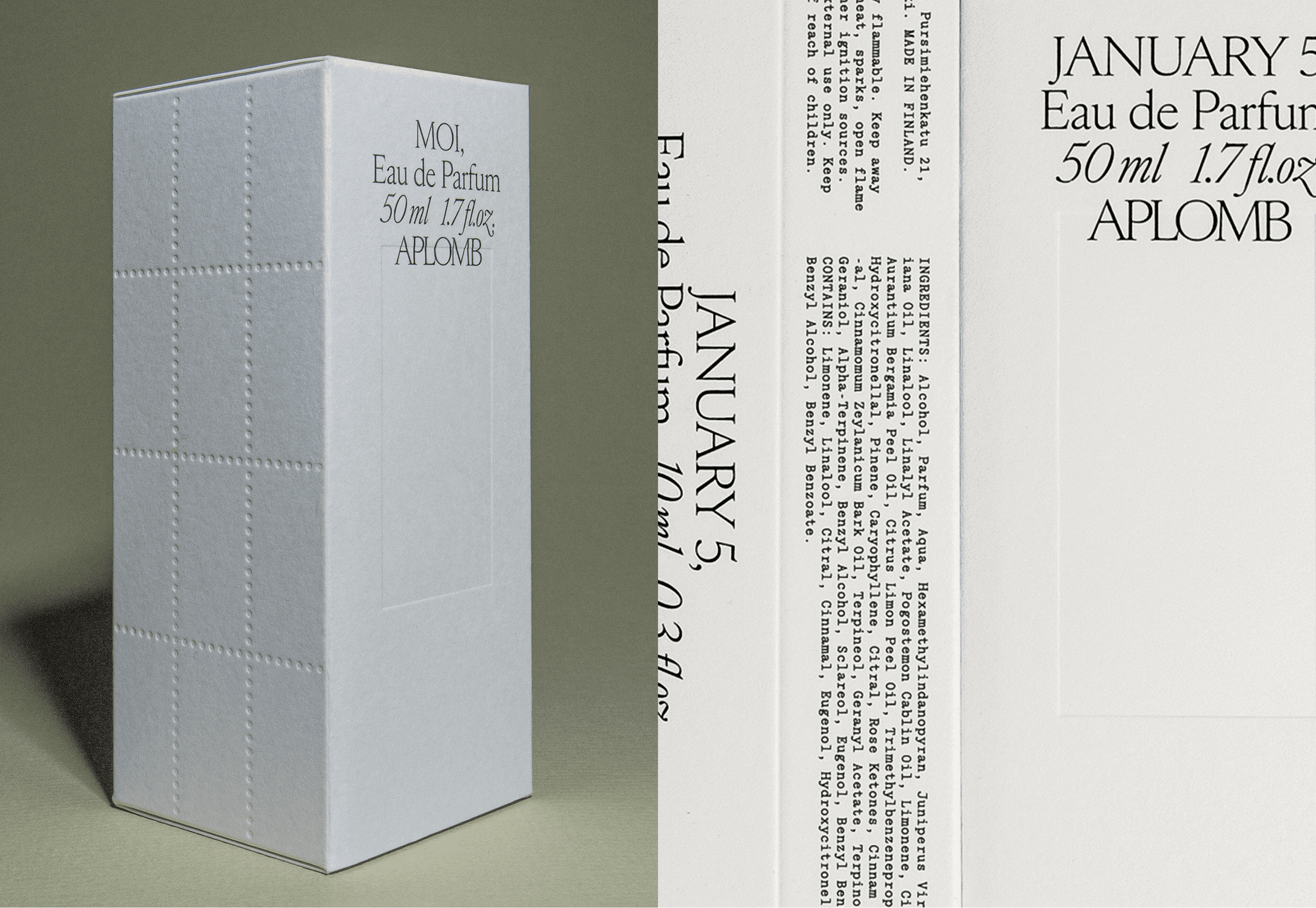
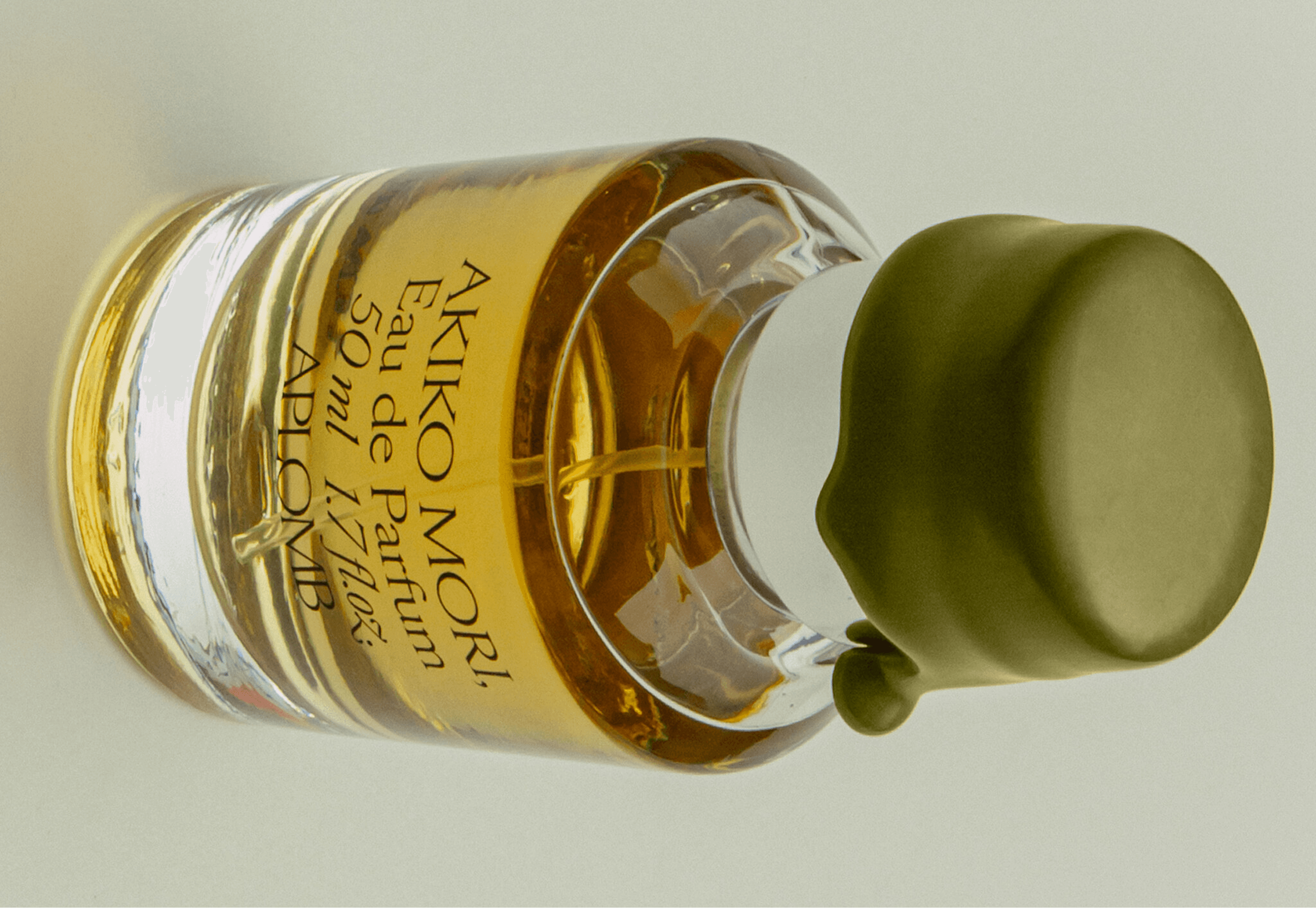
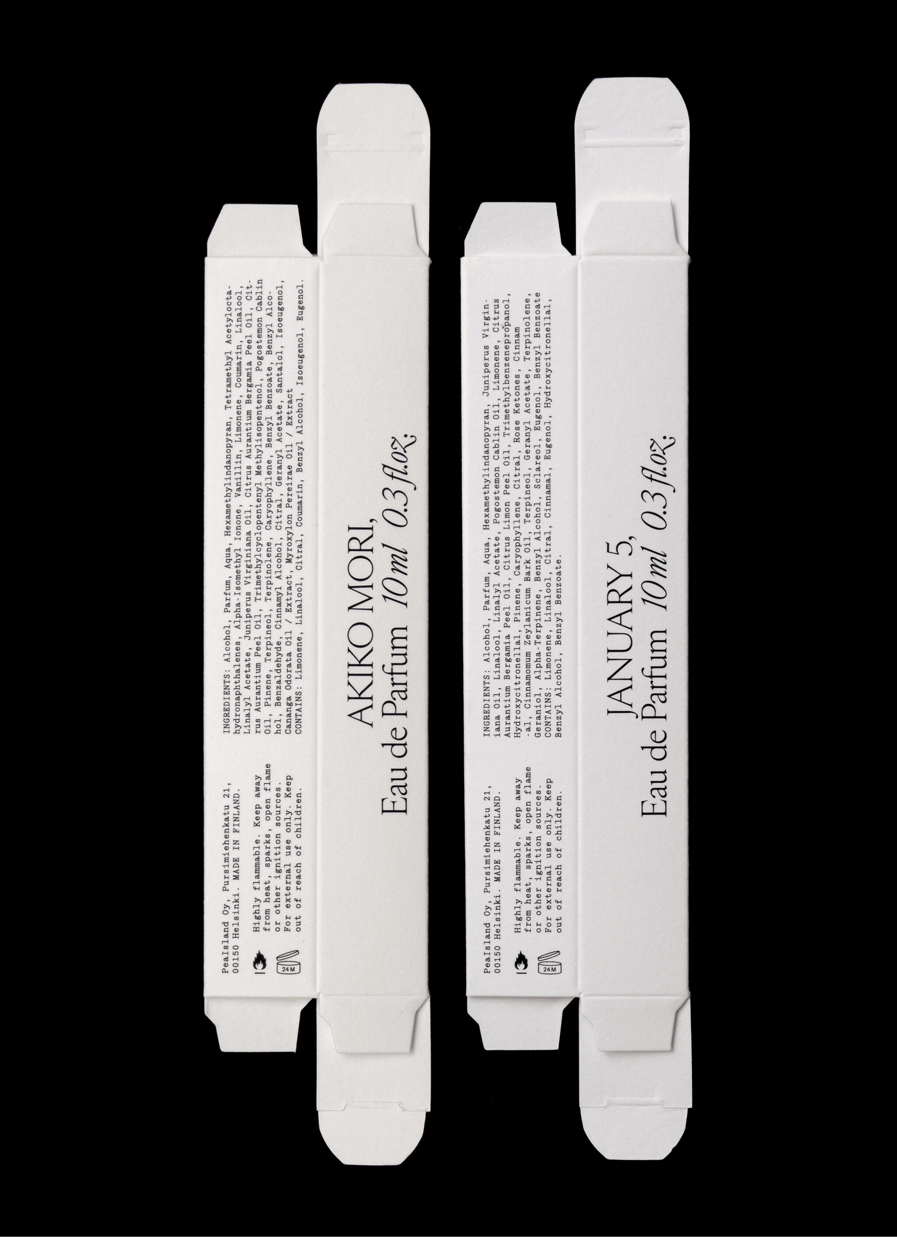
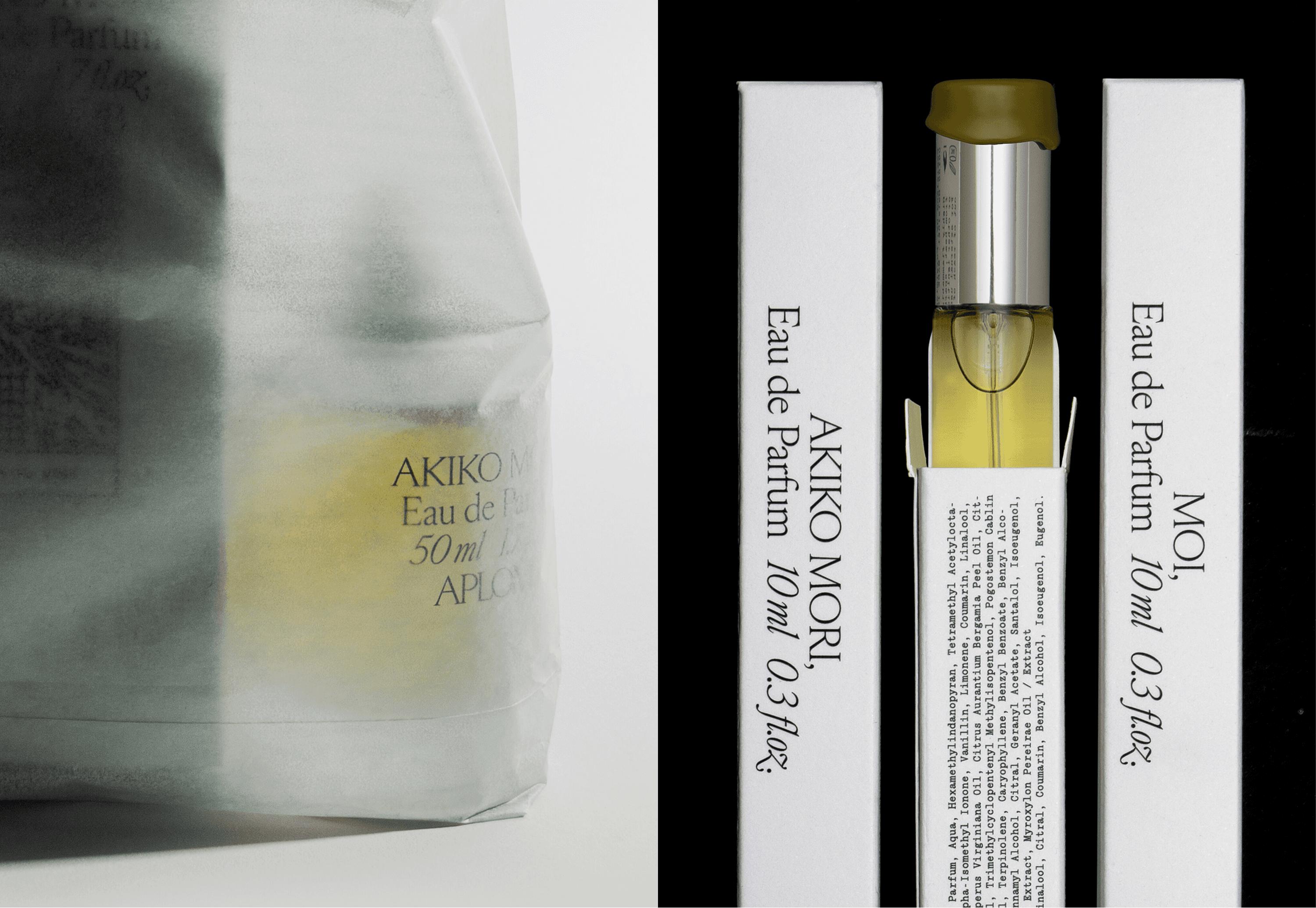
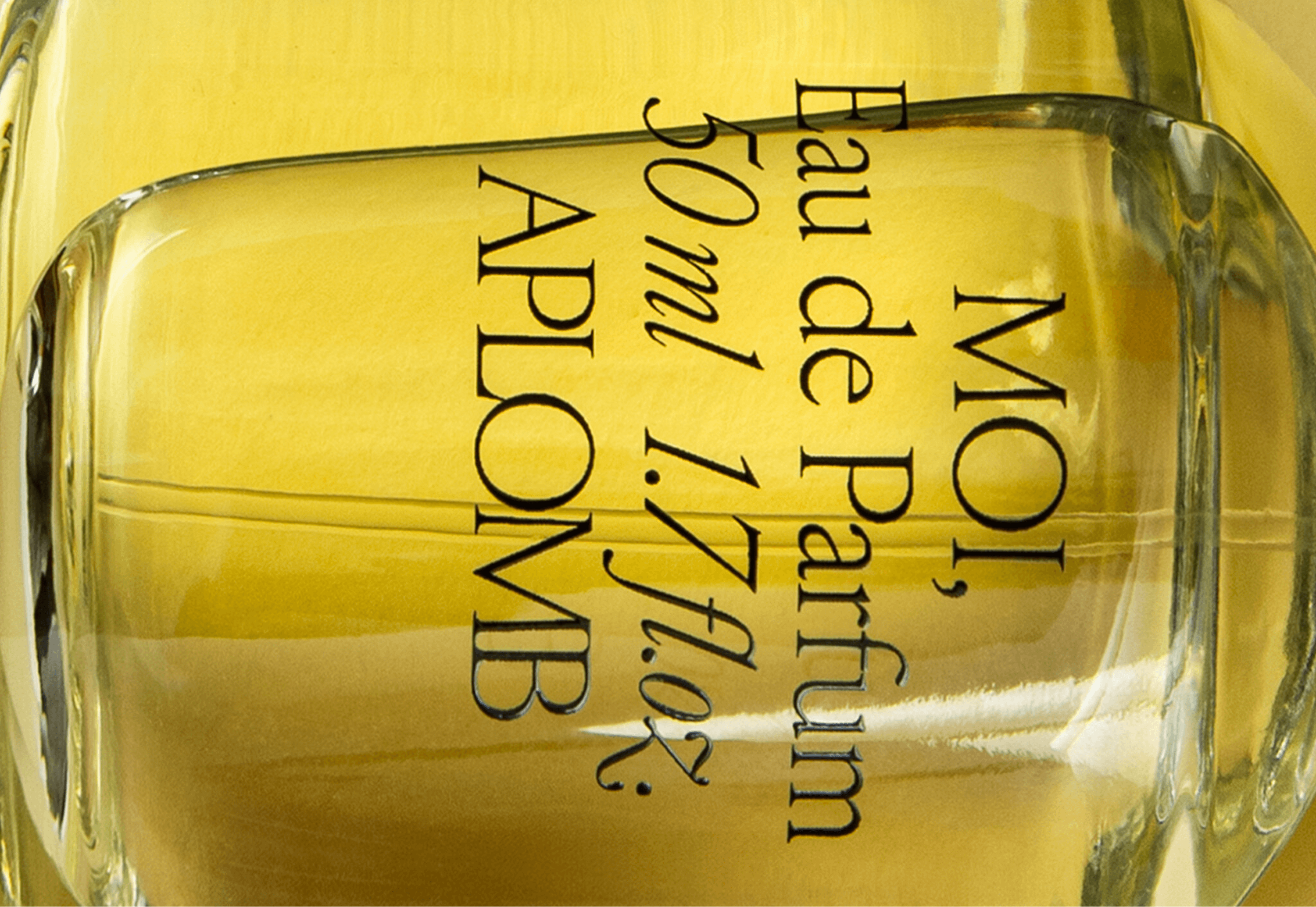
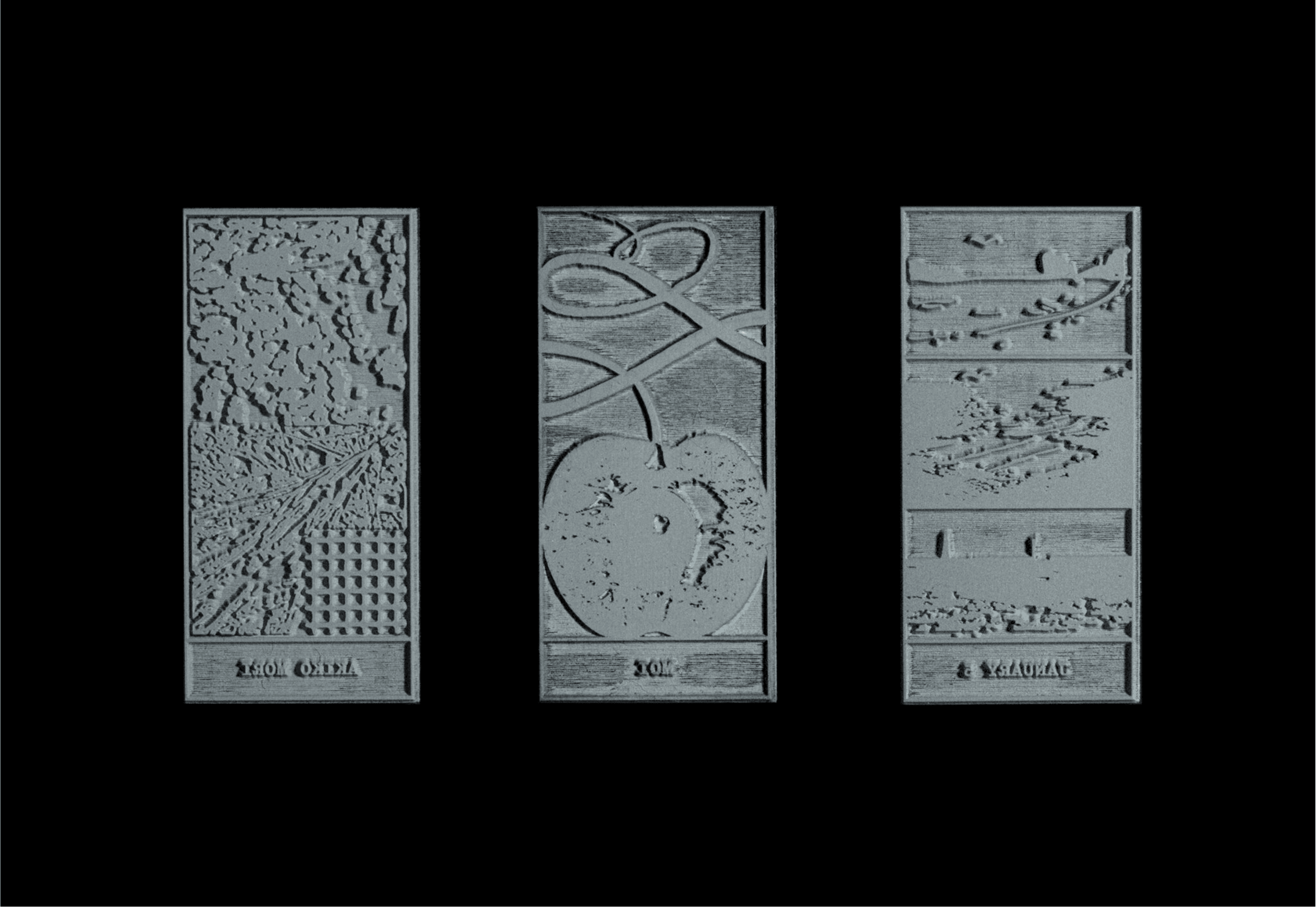
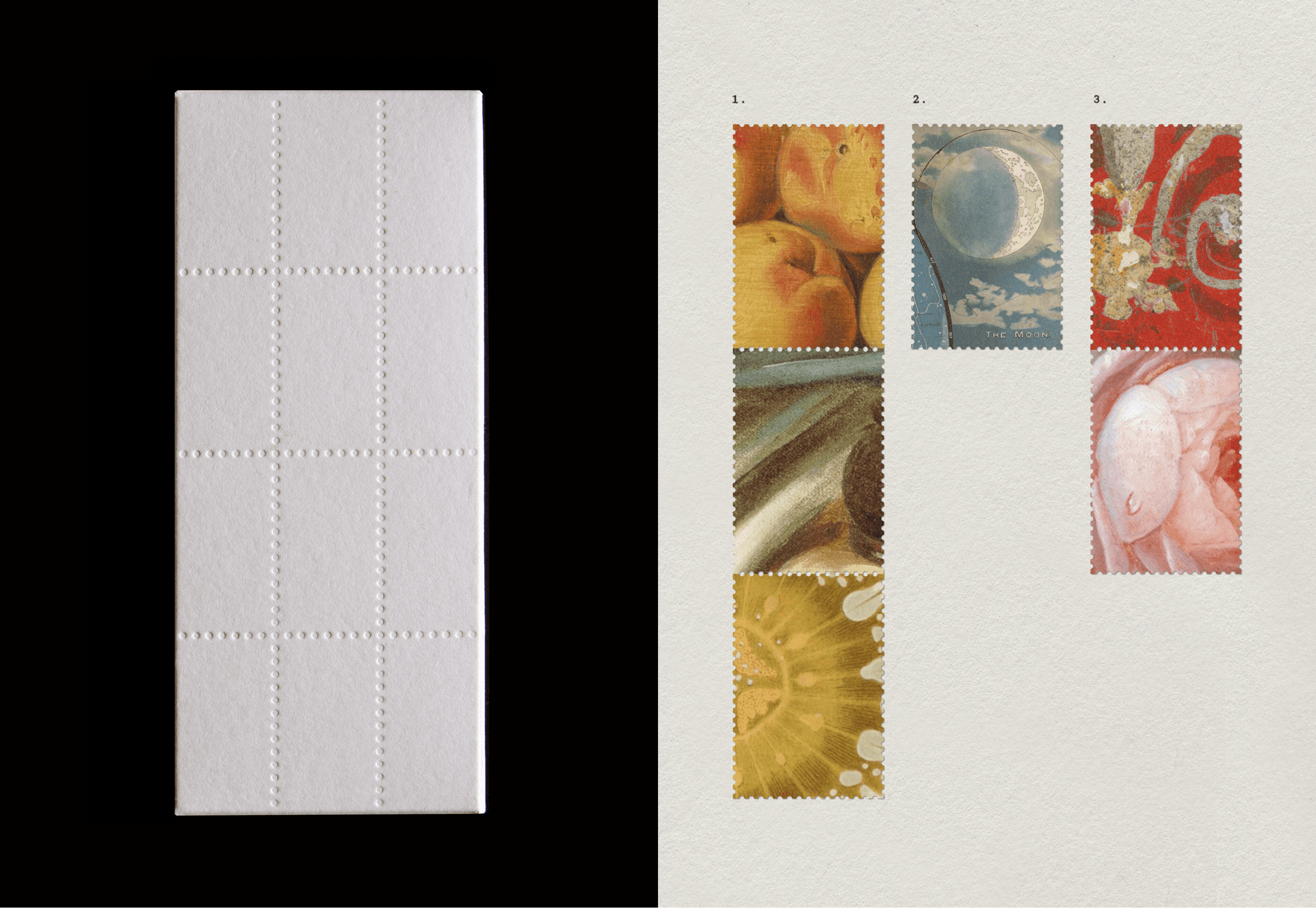
The details carry the concept. Wax sealed caps, typography held to a consistent size, deliberate pauses of white space, and postal marks that read more like poetry than function. Each scent gets its own illustration-based stamp, rooted in the story and personality behind it, and stamps and perforations across the packaging reference the world of letters and postcards directly. The concept isn't decoration here, it's the structure everything hangs on.
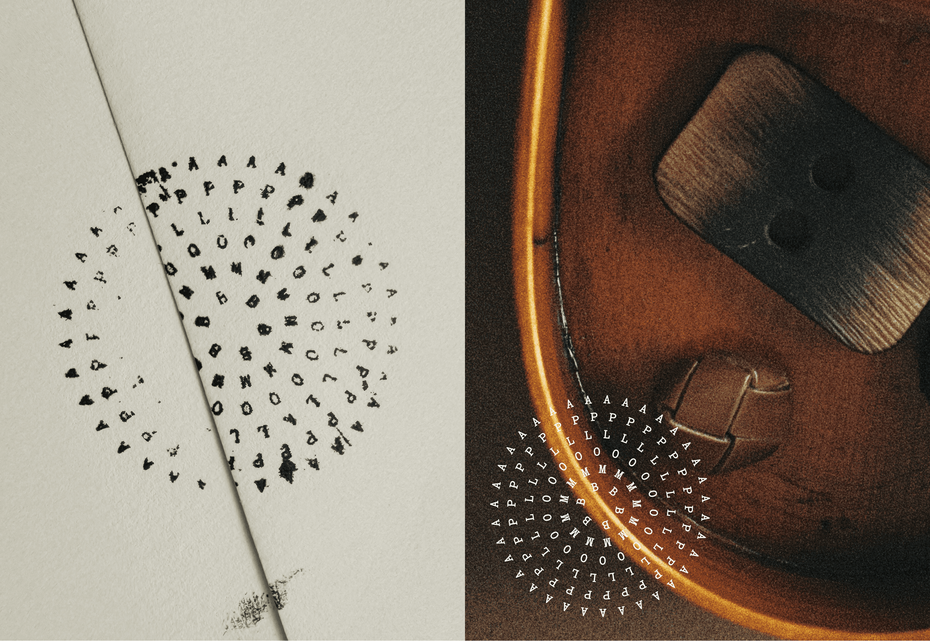
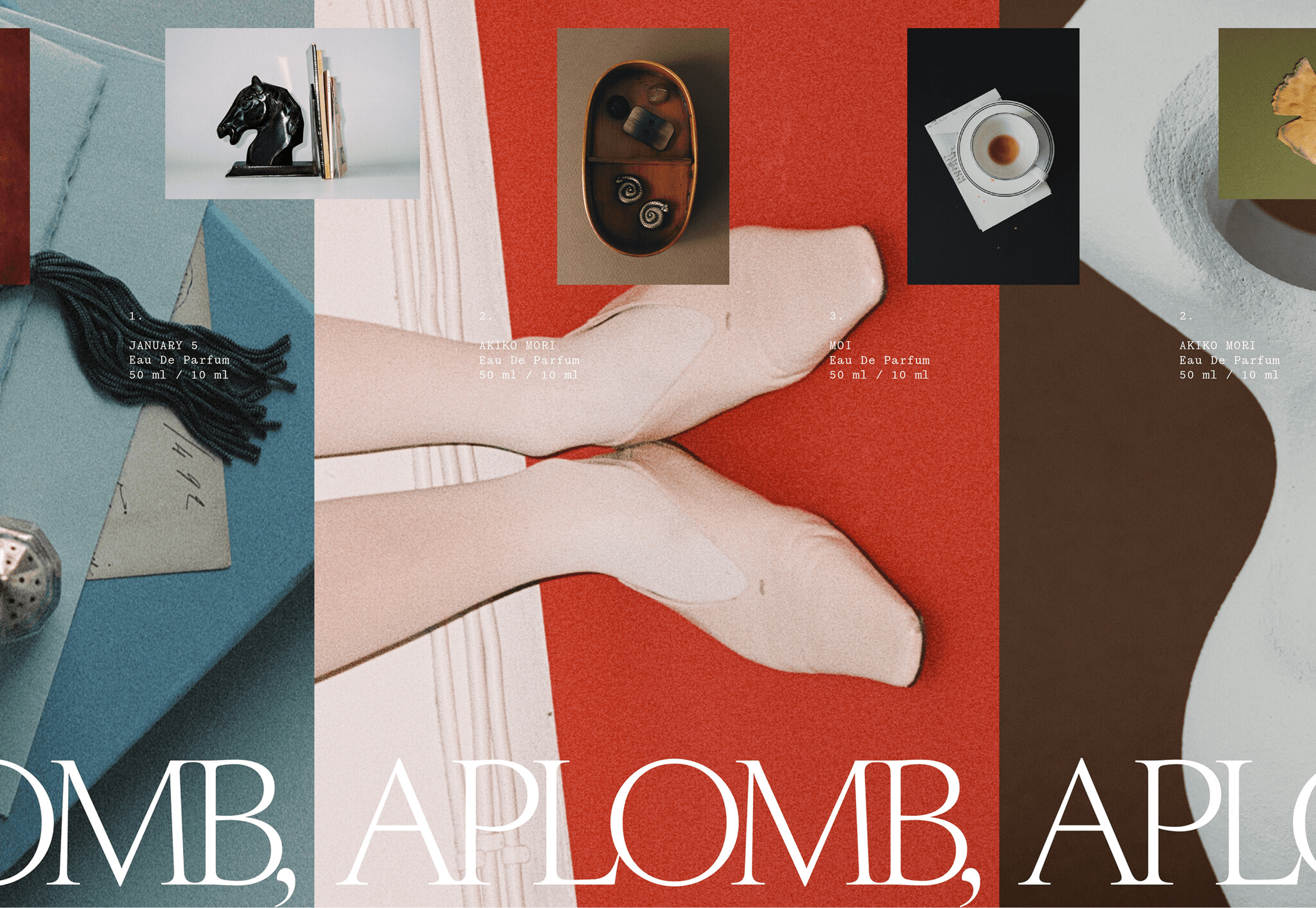
One mark crystallizes it. A comma is worked into the logotype, a nod to the ritual of writing and to the idea of a story that continues beyond the individual. Each scent is supported by its own moodboard that extends the world into illustration and photography, while the palette grows a family of scent-inspired hues alongside neutral tones drawn from stationery.
The result is a brand that turns a fragrance into correspondence. Not a bottle with a name but a letter, sealed and addressed.


