

Estefan Richter & Matheus Sakita
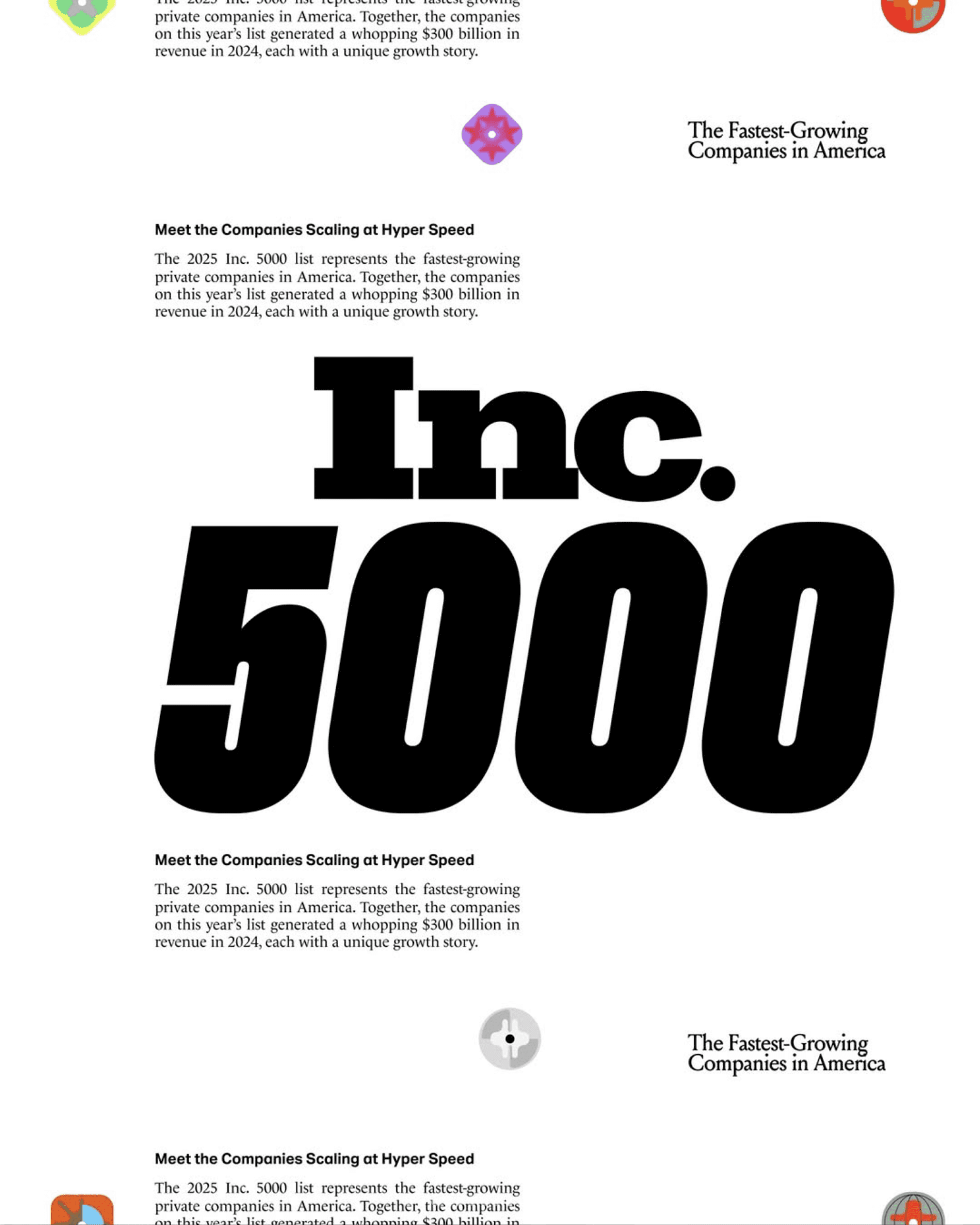
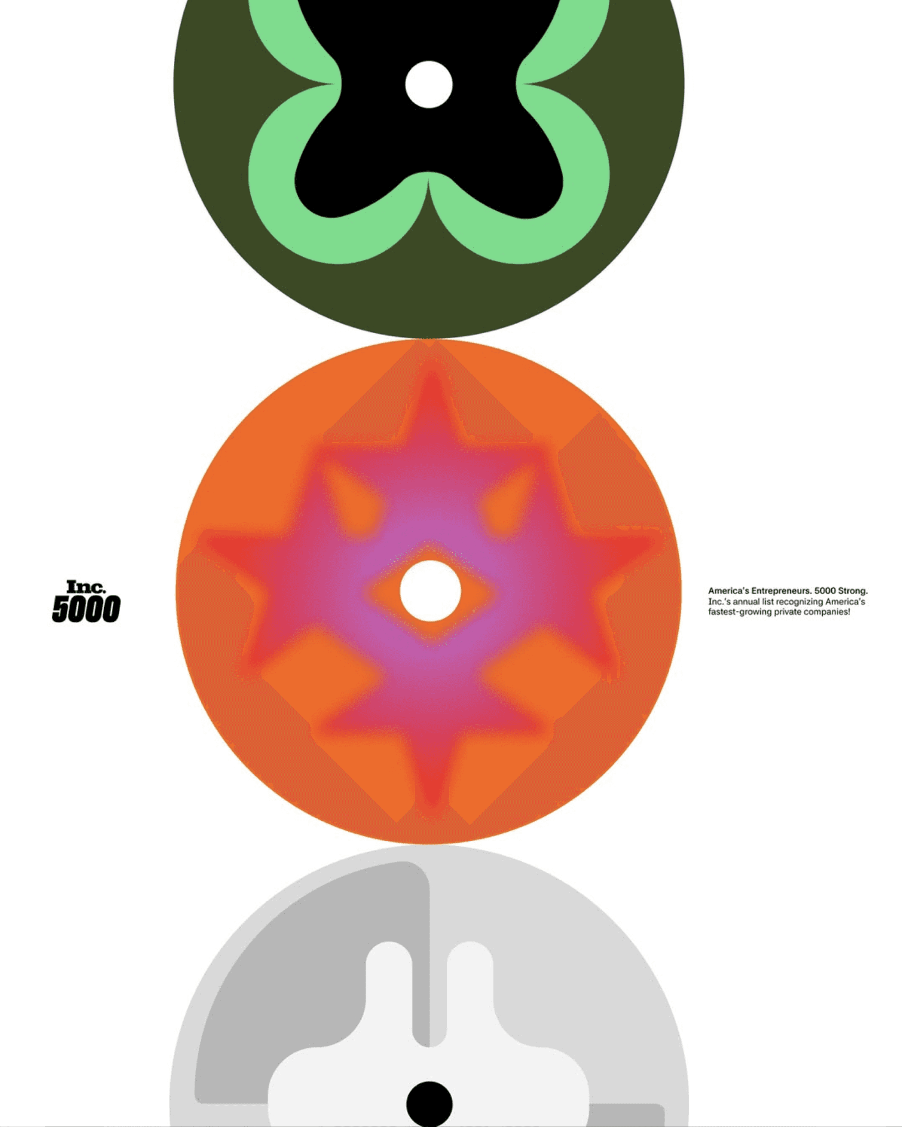
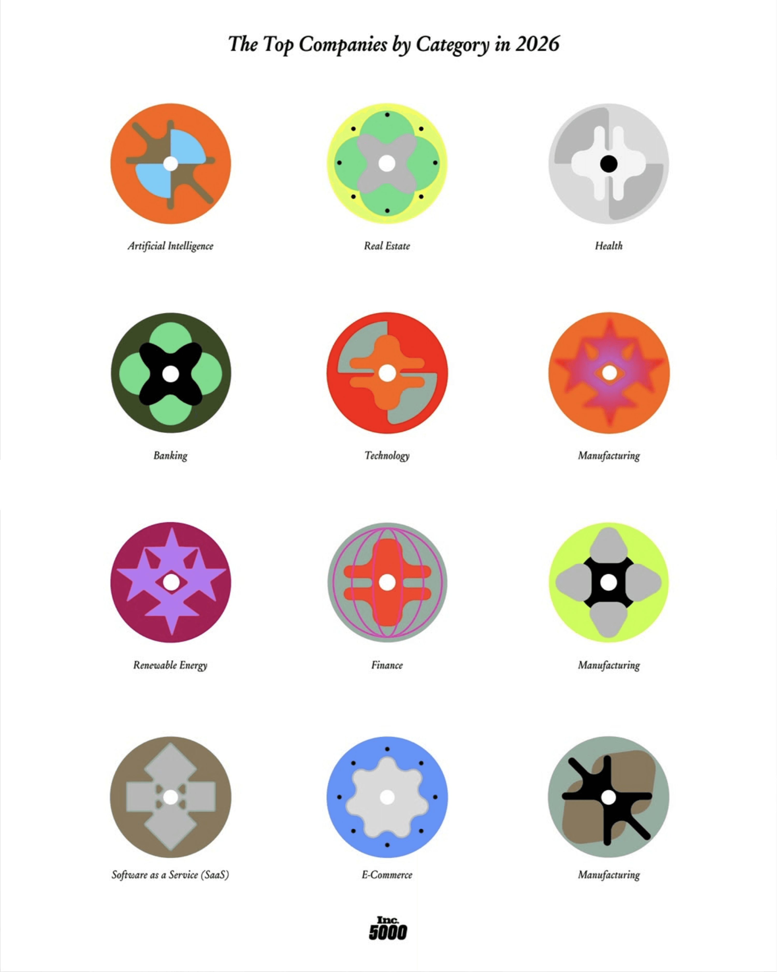
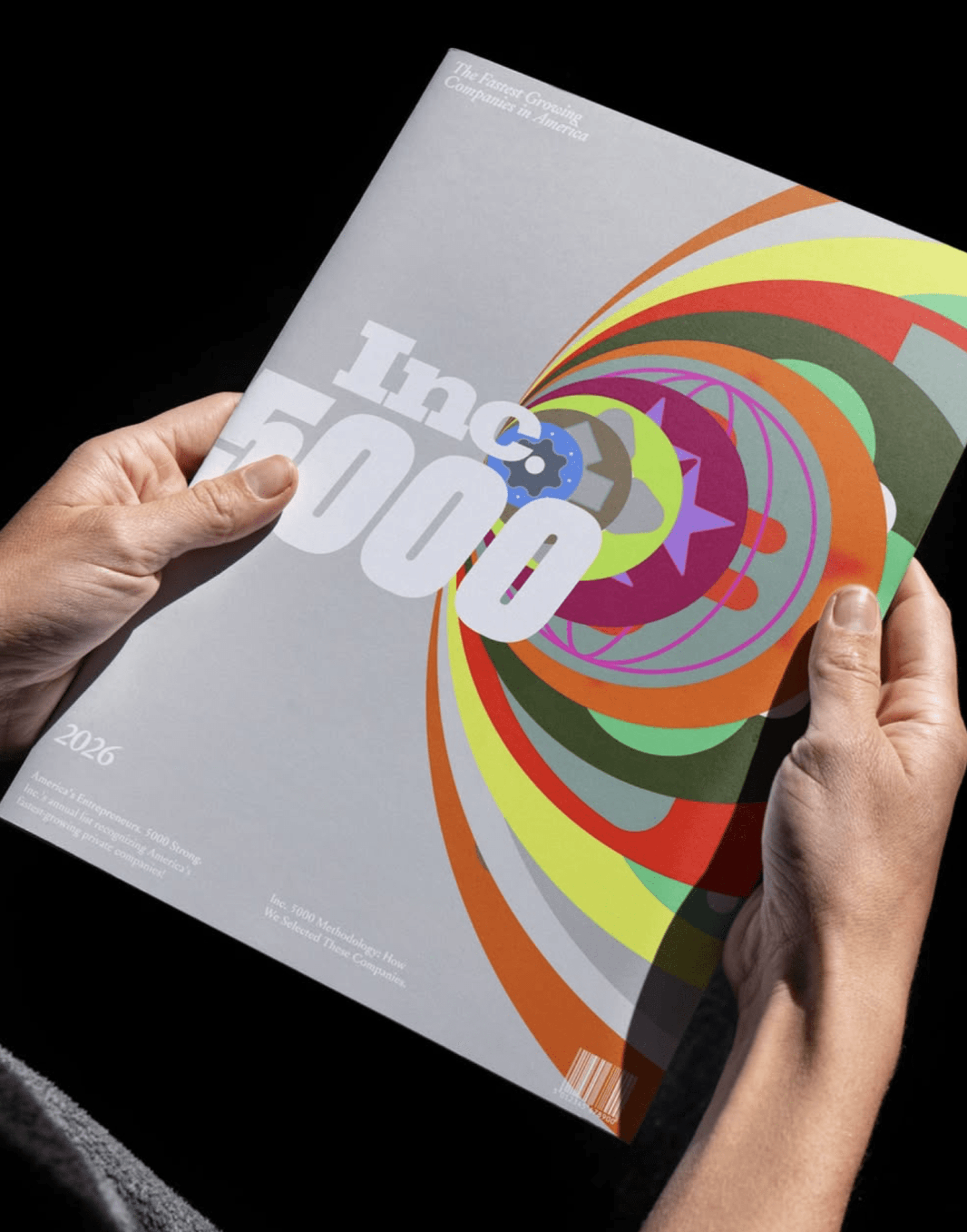
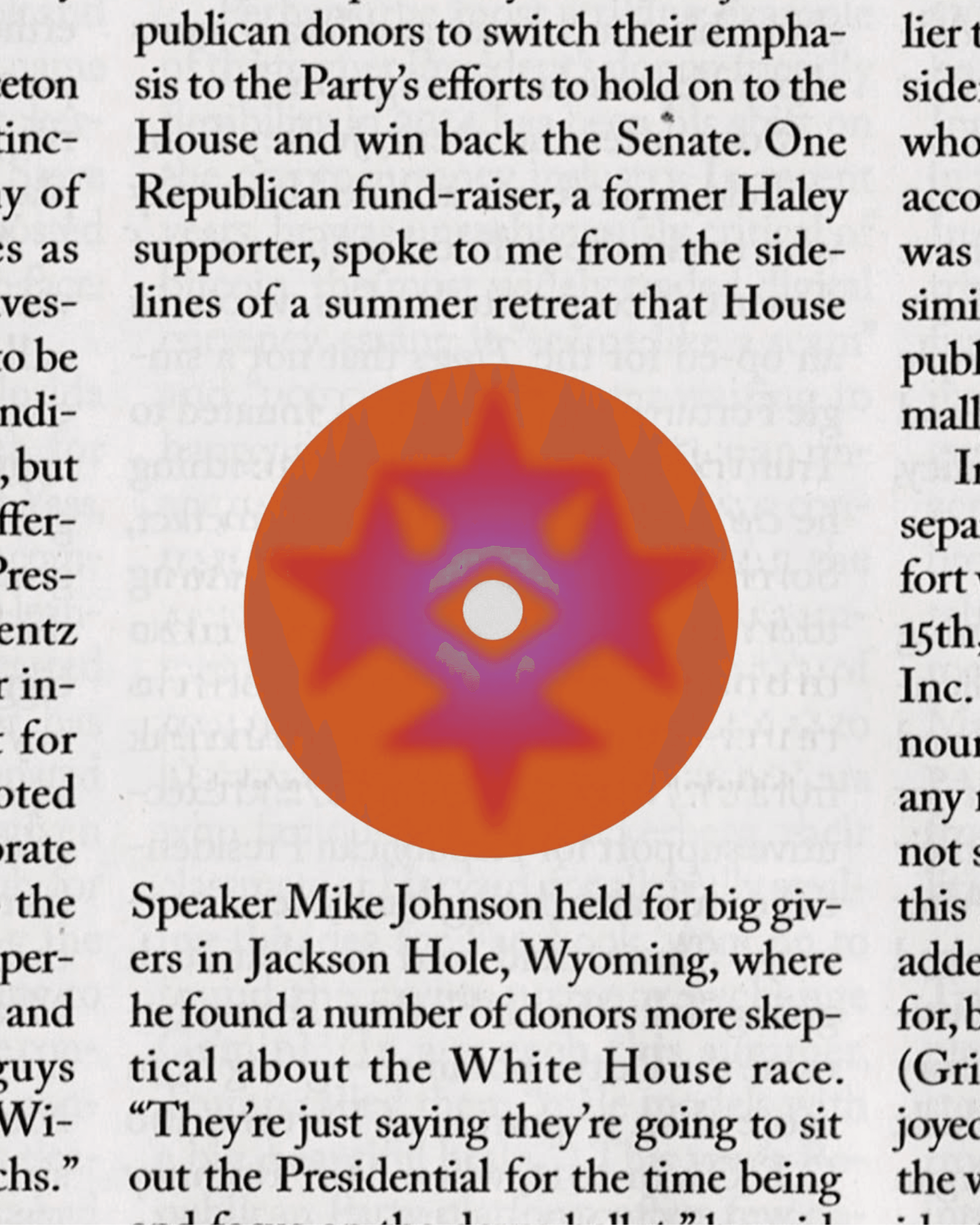
Estefan Richter and Matheus Sakita developed a design route for Inc.'s yearly event and special magazine edition, invited to come up with directions that represent multiplicity. Everything starts from the dot. Taking the period from the Inc. logo itself, the concept builds an entire universe of planets from a single existing mark.
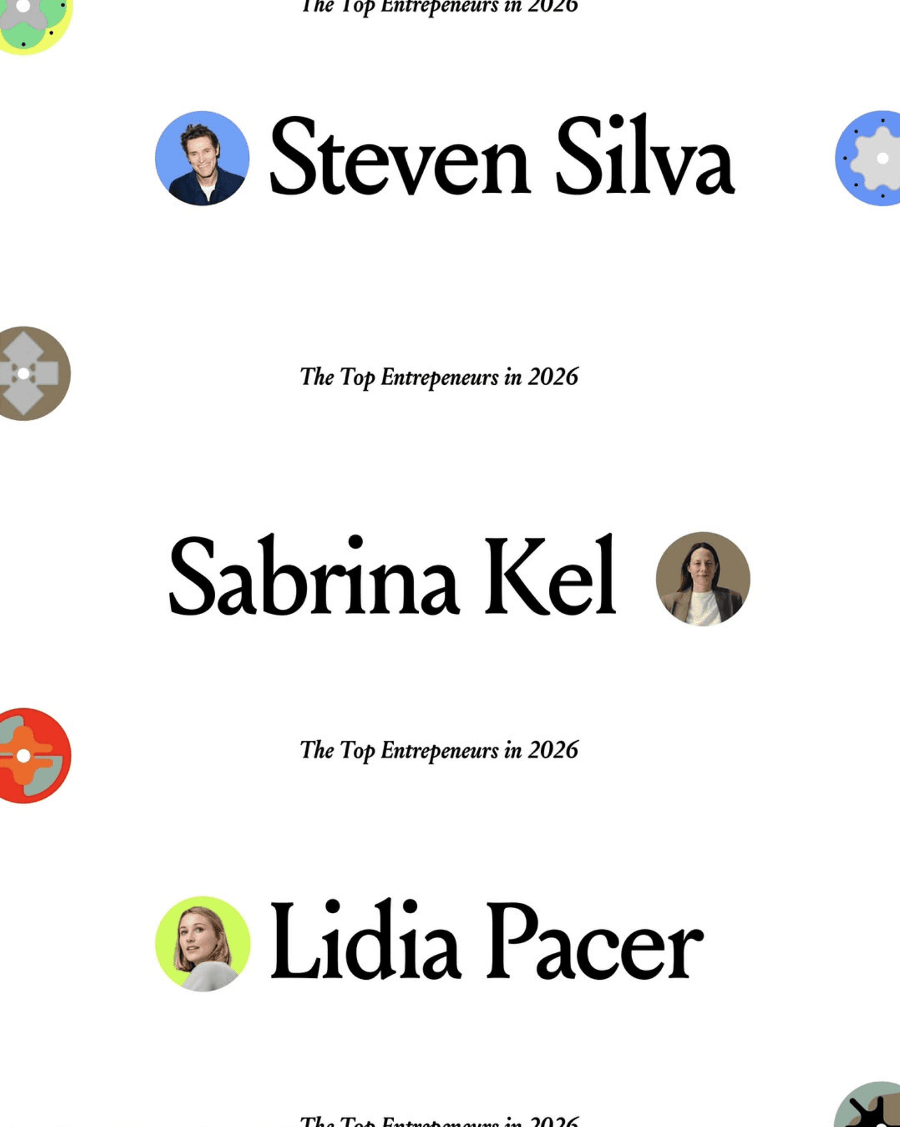
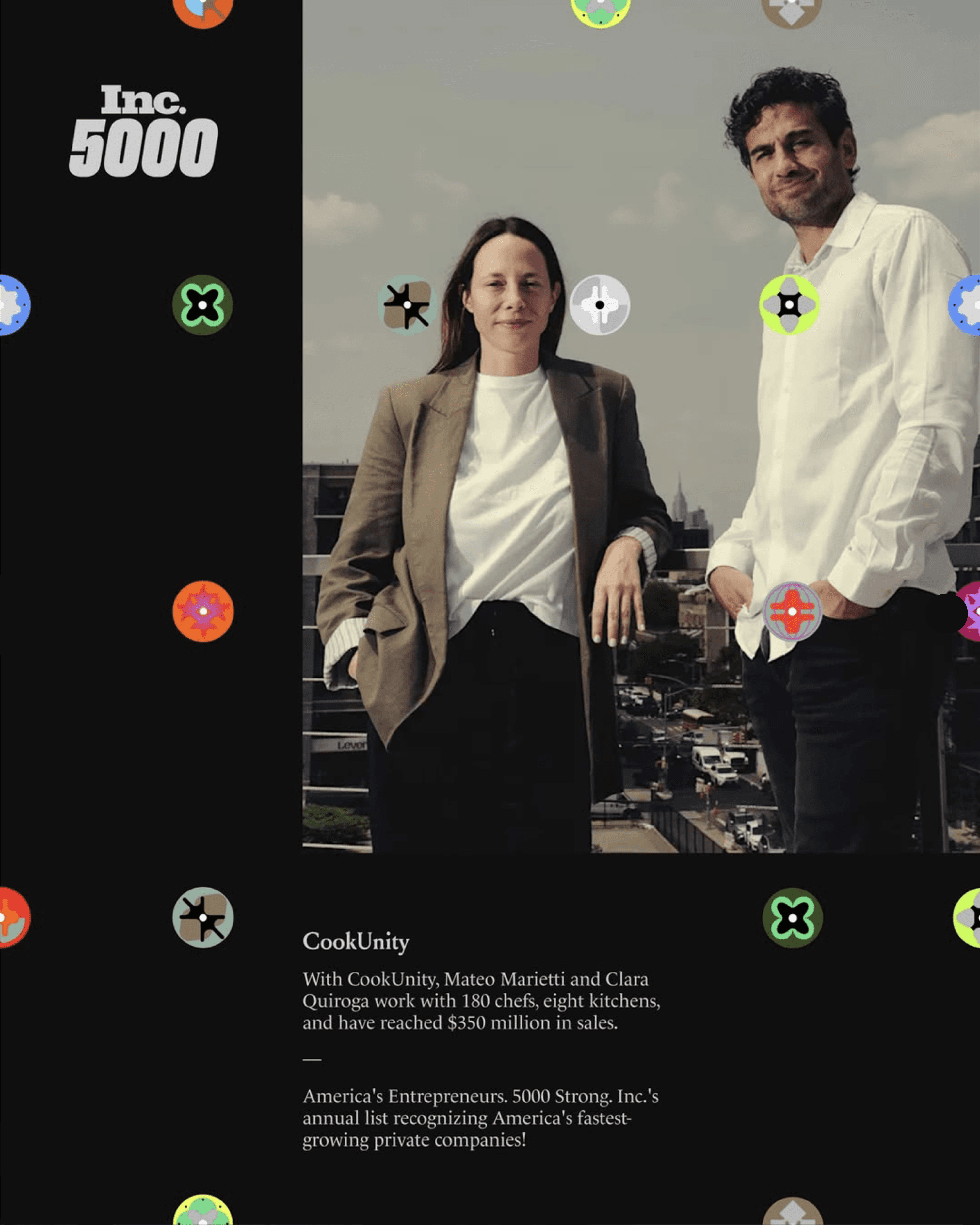
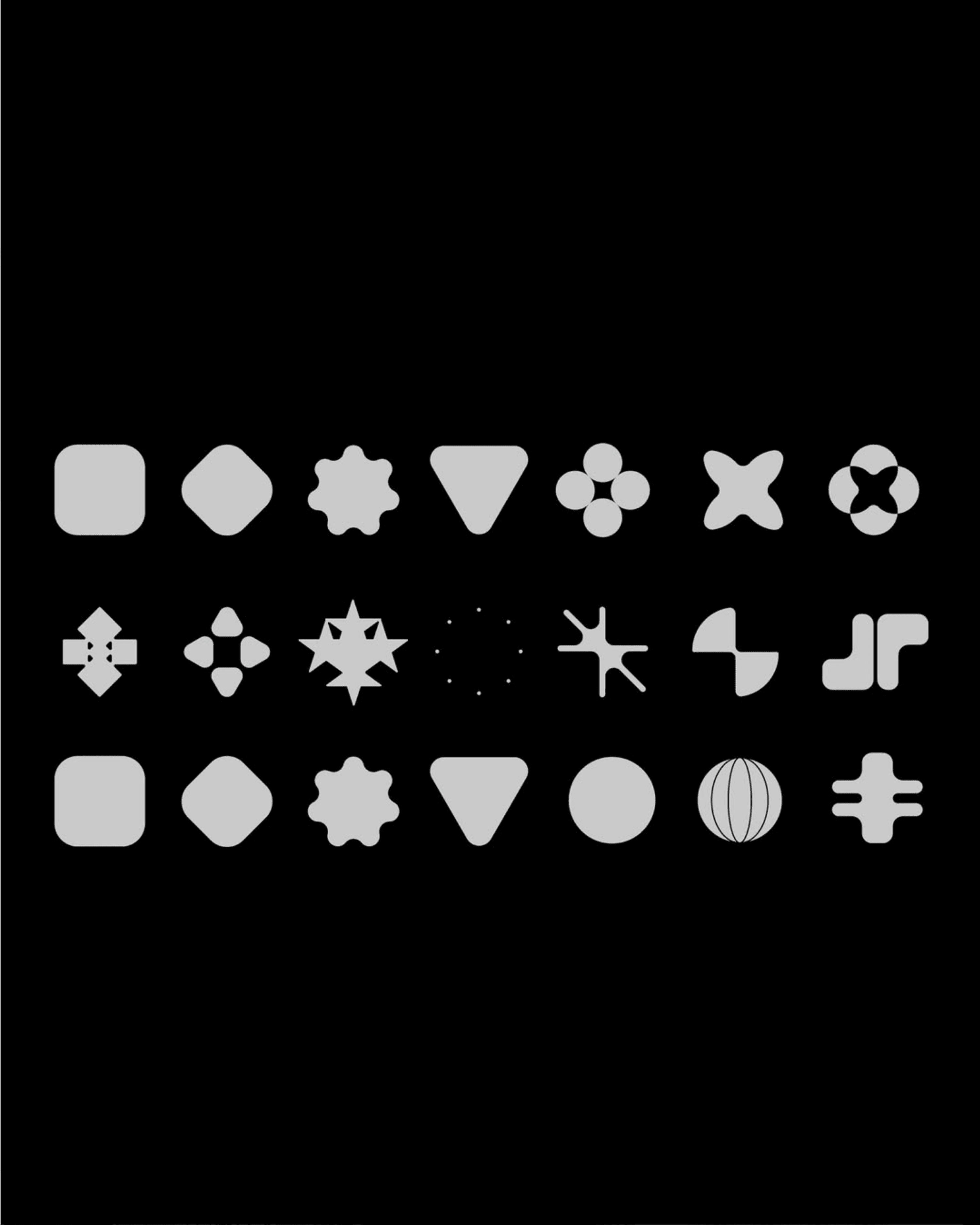
The system grows from that one element. Each cell is unique, standing for a category, a company, a person, and together they tell a story of growth, plurality and optimism. In an ideal world there are 5,000 of them, one for every name on the list. The idea takes the smallest part of the logo and turns it into the whole picture.
One note worth keeping. This route was archived rather than run, shared here because the thinking held up regardless. Creative direction by Caya Tull and Richard Baker, design by Estefan Richter and Matheus Sakita.


