FCKLCK
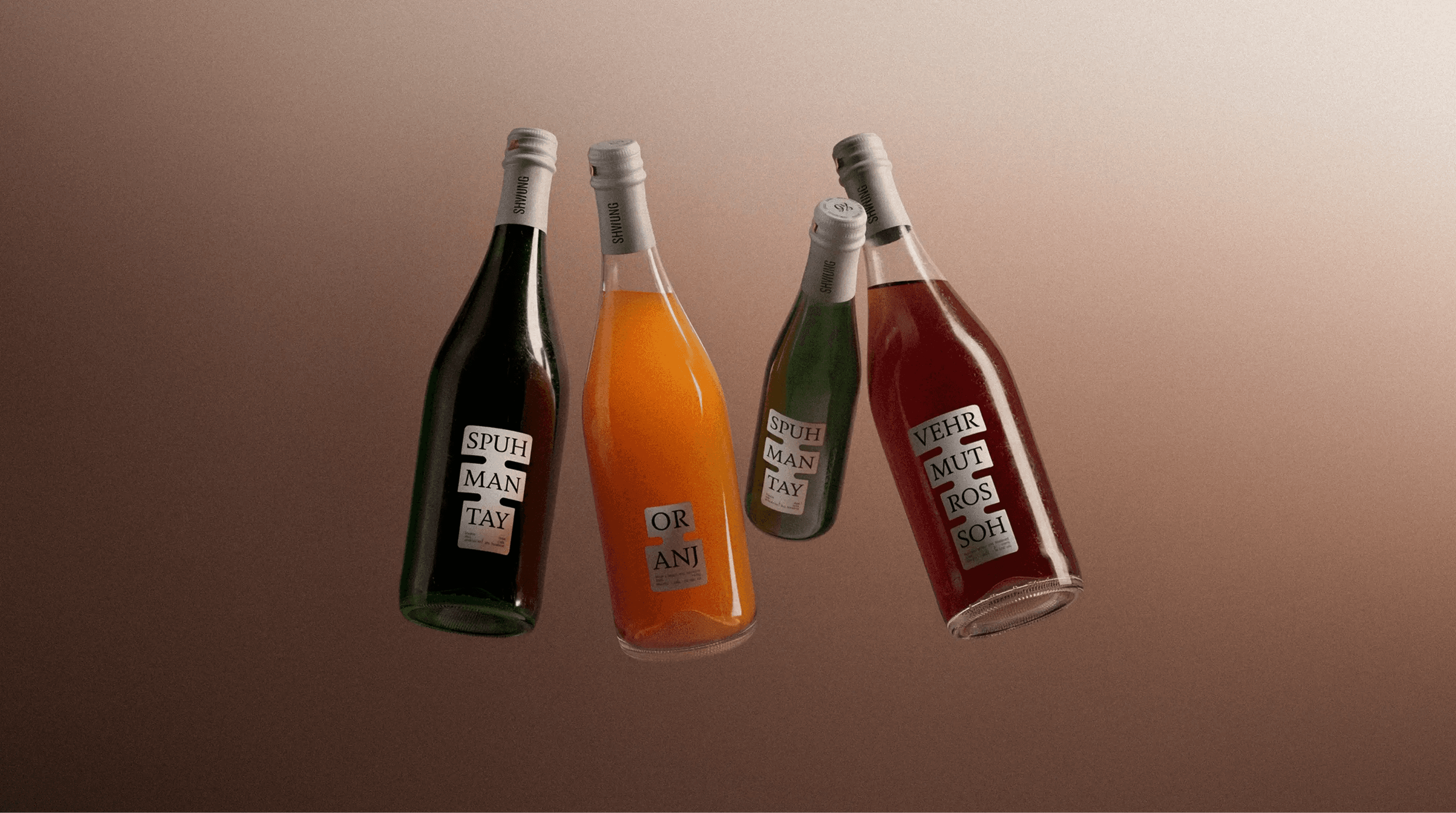
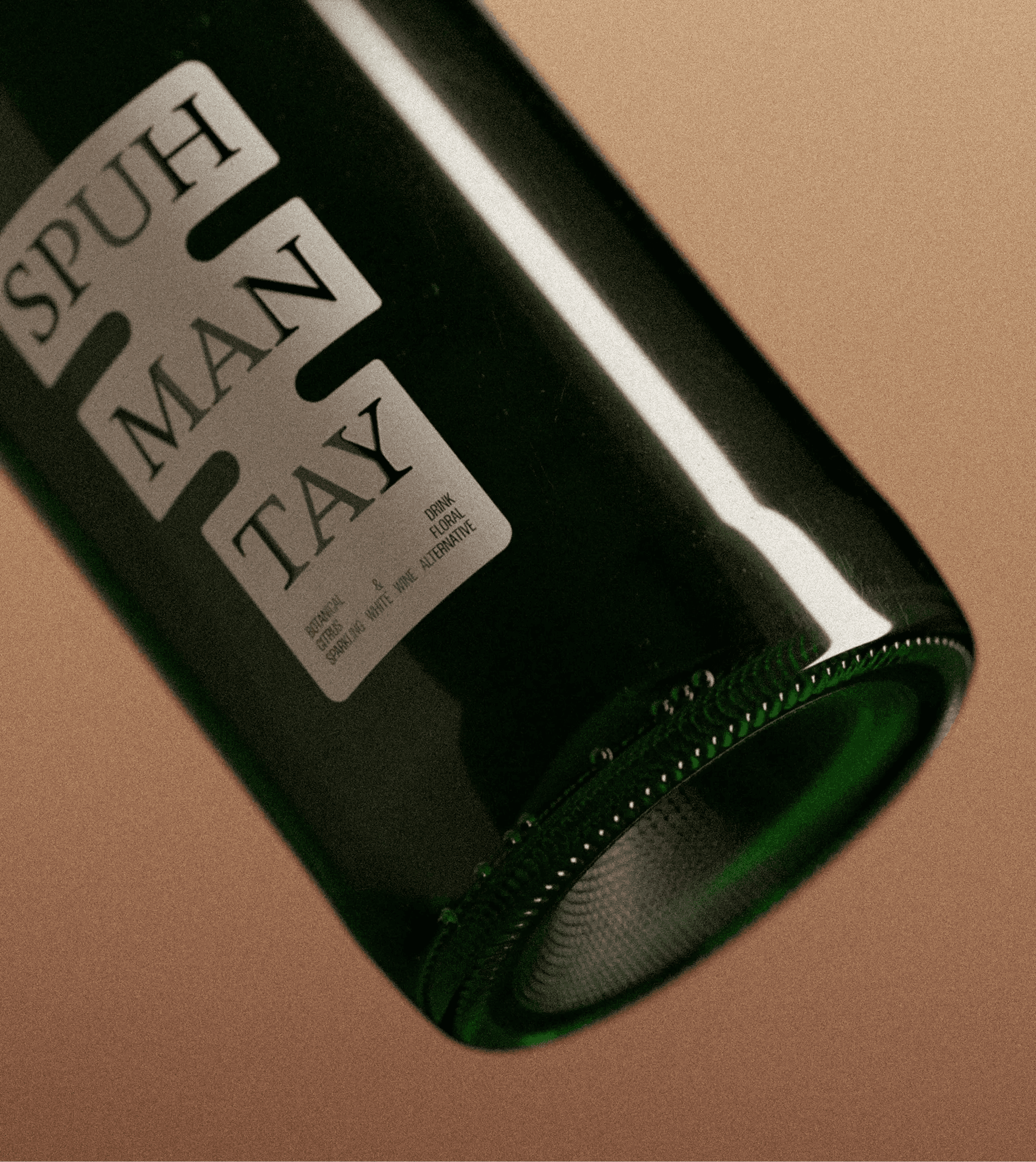
FCKLCK Studio developed the brand identity for Shwung, a brand of alcohol-free wine alternatives, after a forced name change from SOBR. The brief looked like packaging but the real problem sat deeper: how do you sell something that isn't wine as wine.
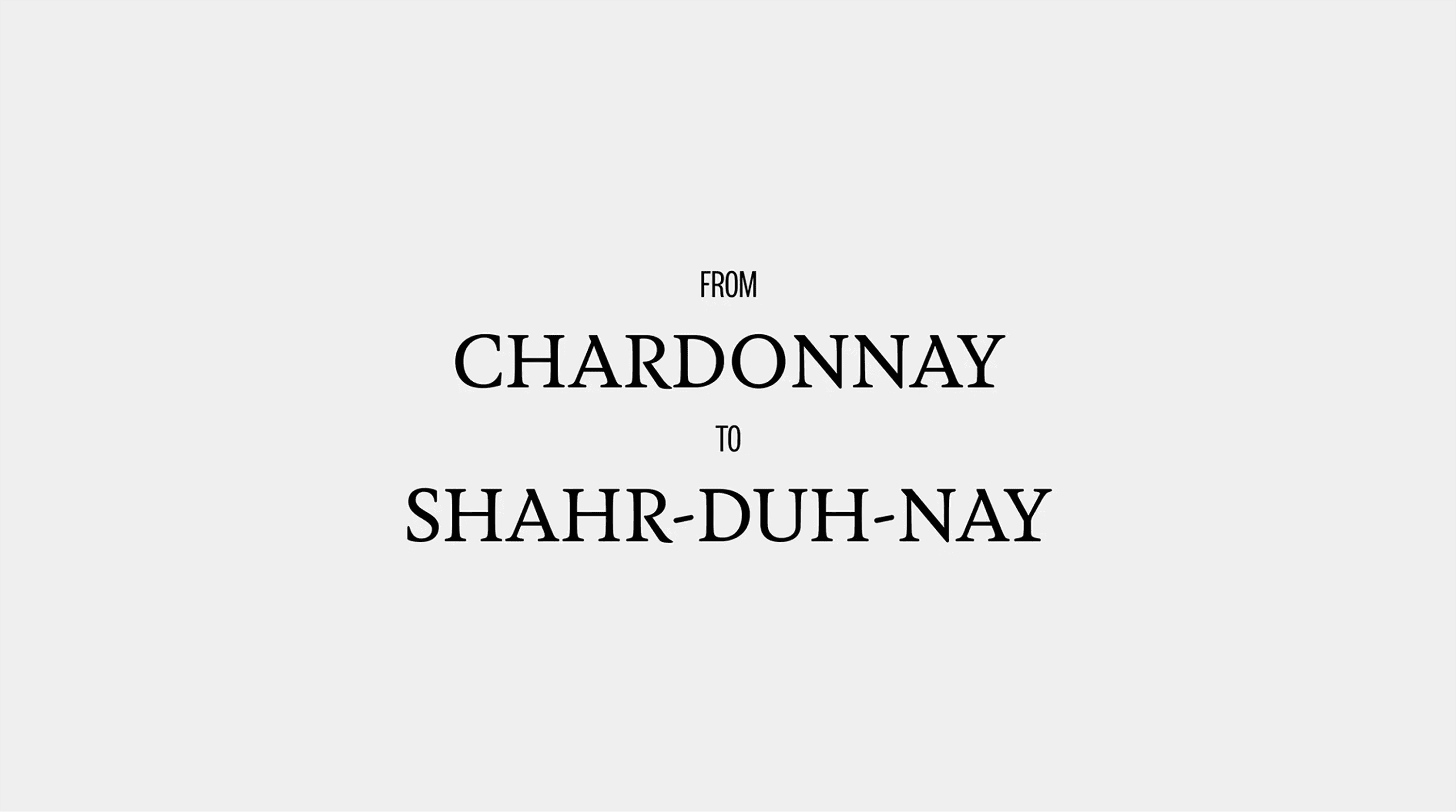
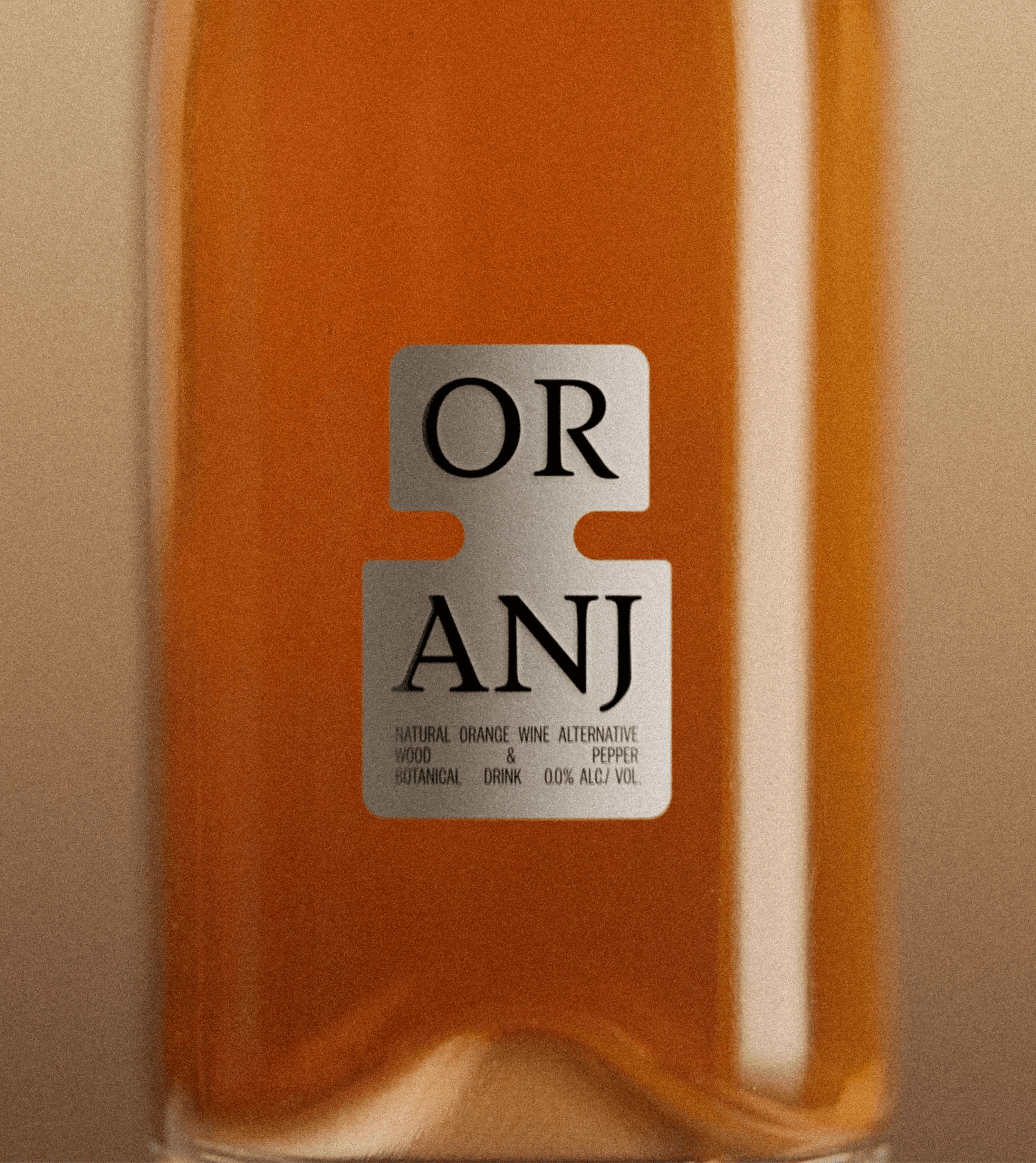
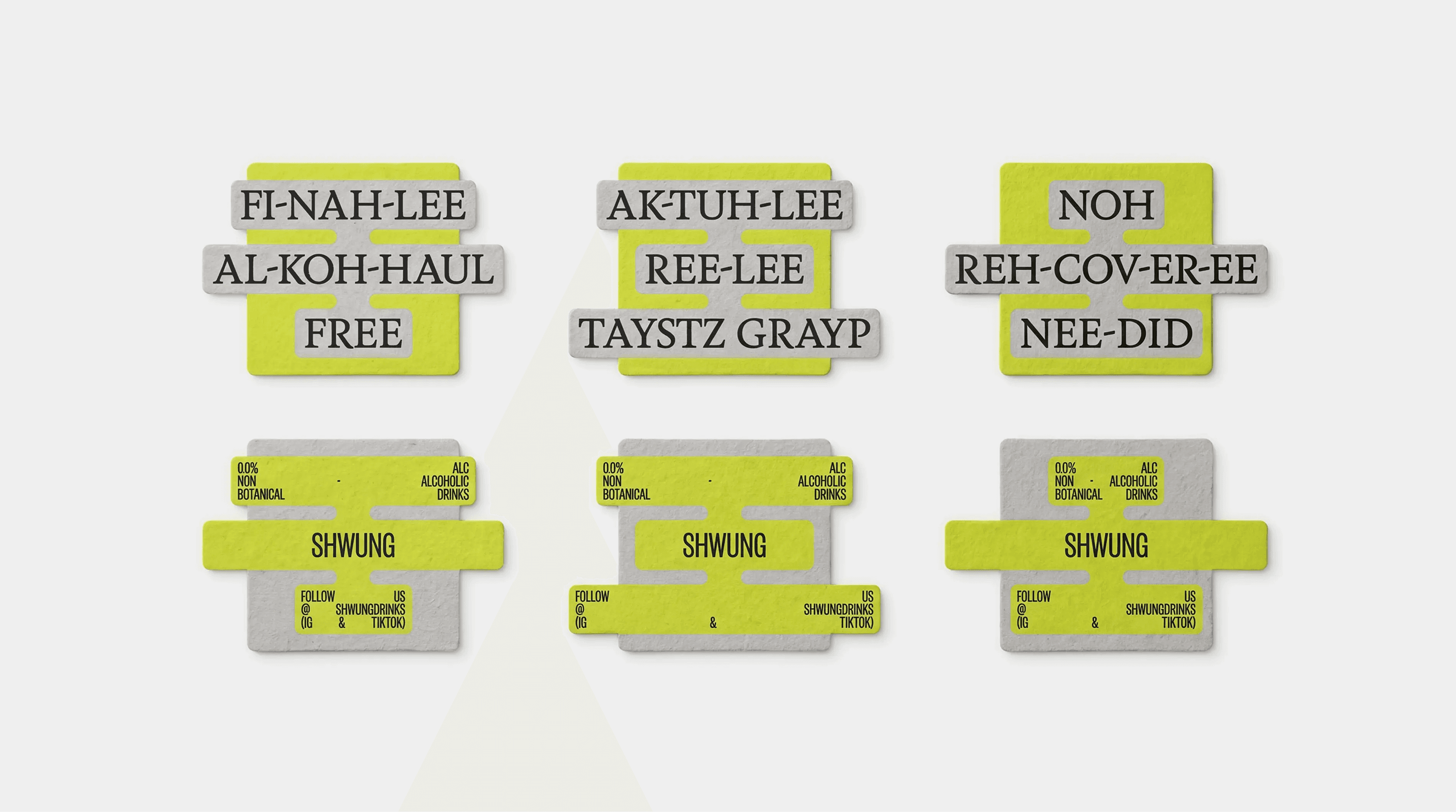
The category set the tension. Lean too close to wine and you risk confusion, move too far and you lose the ritual and cultural cues people associate with it. After studying those cues, the studio landed on a phonetic naming system, where each product name is written the way it sounds when spoken aloud in its language of origin. Familiar enough to signal wine, altered enough to make clear it is something else.
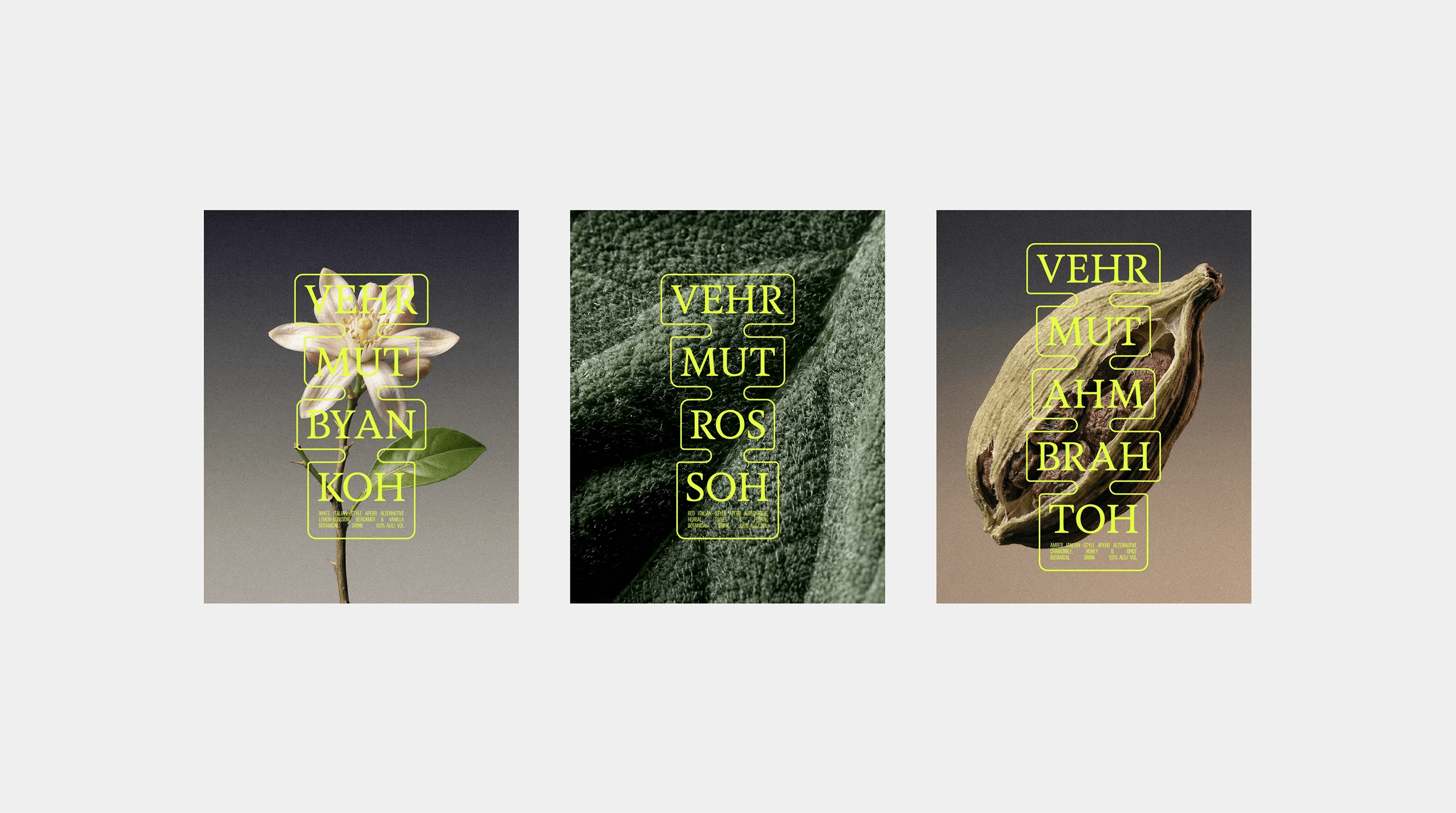
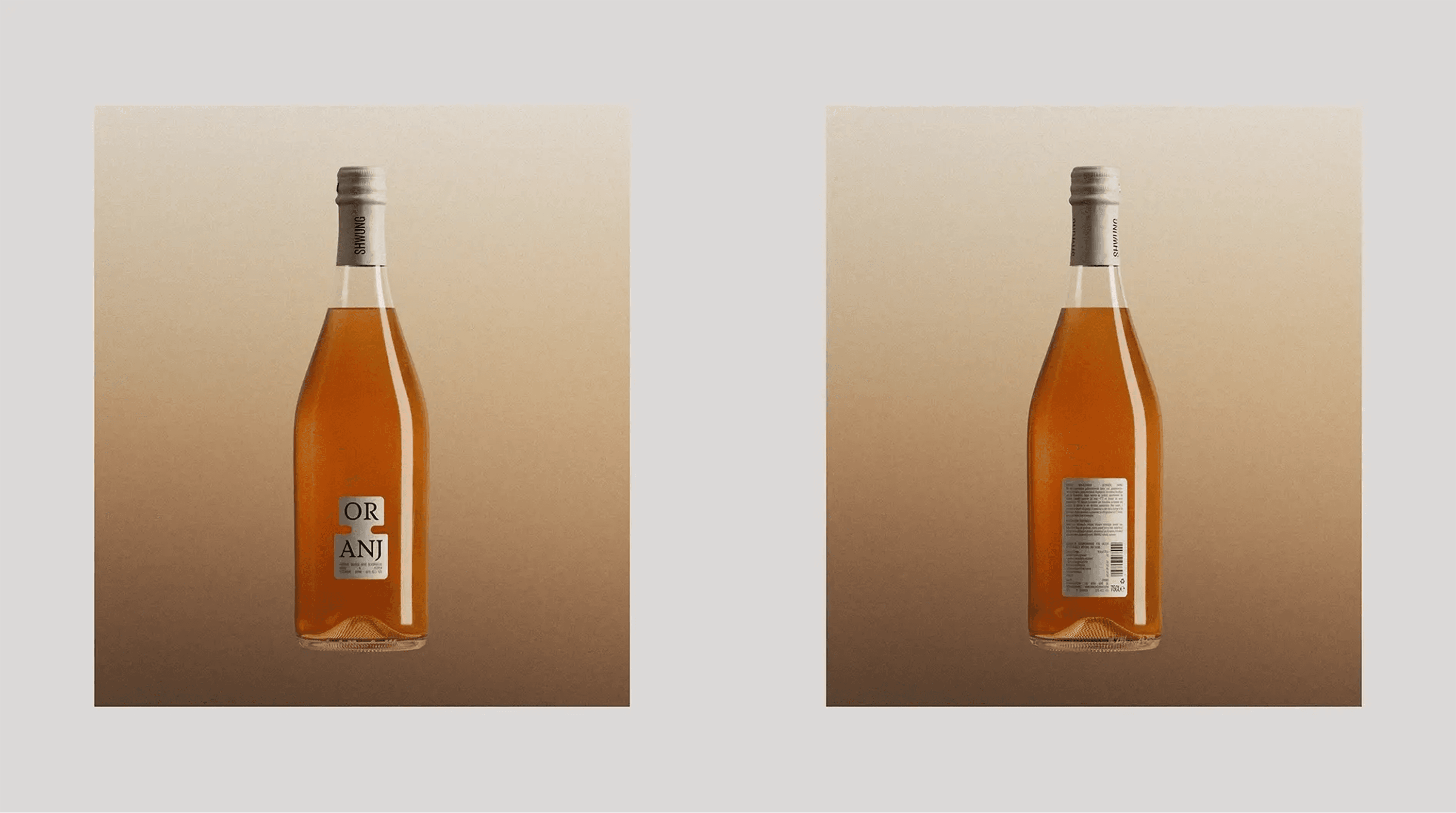
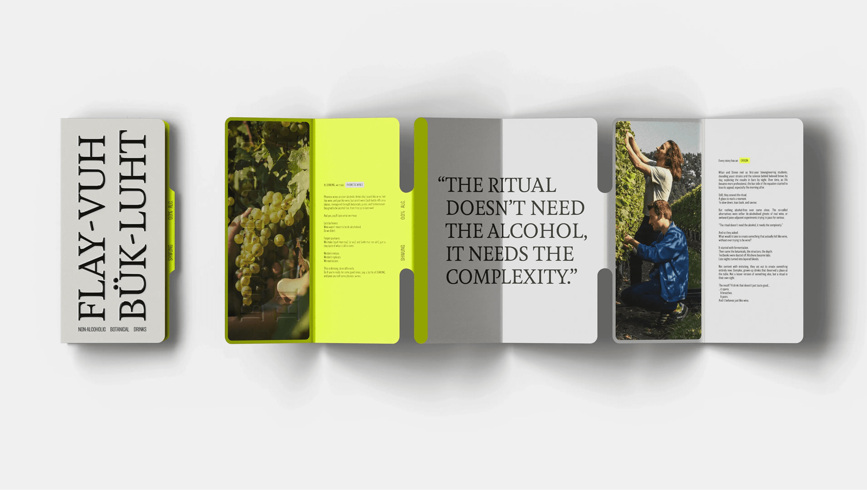
That phonetic logic became the backbone of the whole identity. Names and key messaging break into phonetic blocks that stack vertically, shaping label proportions, spacing and rhythm across every carrier. Language defines form, which keeps the system consistent while letting it adapt to content. A restrained palette of grey, black and white holds it steady, with fluo yellow used sparingly as a disruptive accent, and the pairing of Feijoa Medium and Founders Grotesk X-Condensed from Klim balances character with precision.
The result lets Shwung sound like wine, read like wine, look like wine and behave like wine, without ever claiming to be wine.