

Carla Palette
Carla Palette developed the brand identity, packaging and art direction for SONS, a UK wine brand built on a simple idea: unpretentious wine for good company. Wine branding tends toward excess. SONS moves the other way, stripping the category's usual signals down to bold simplicity and confident restraint.
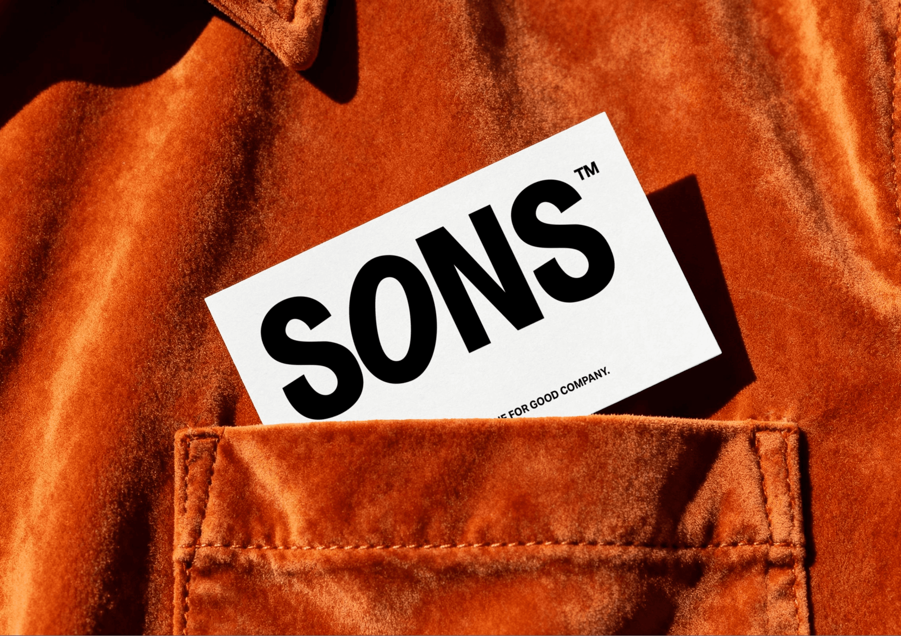
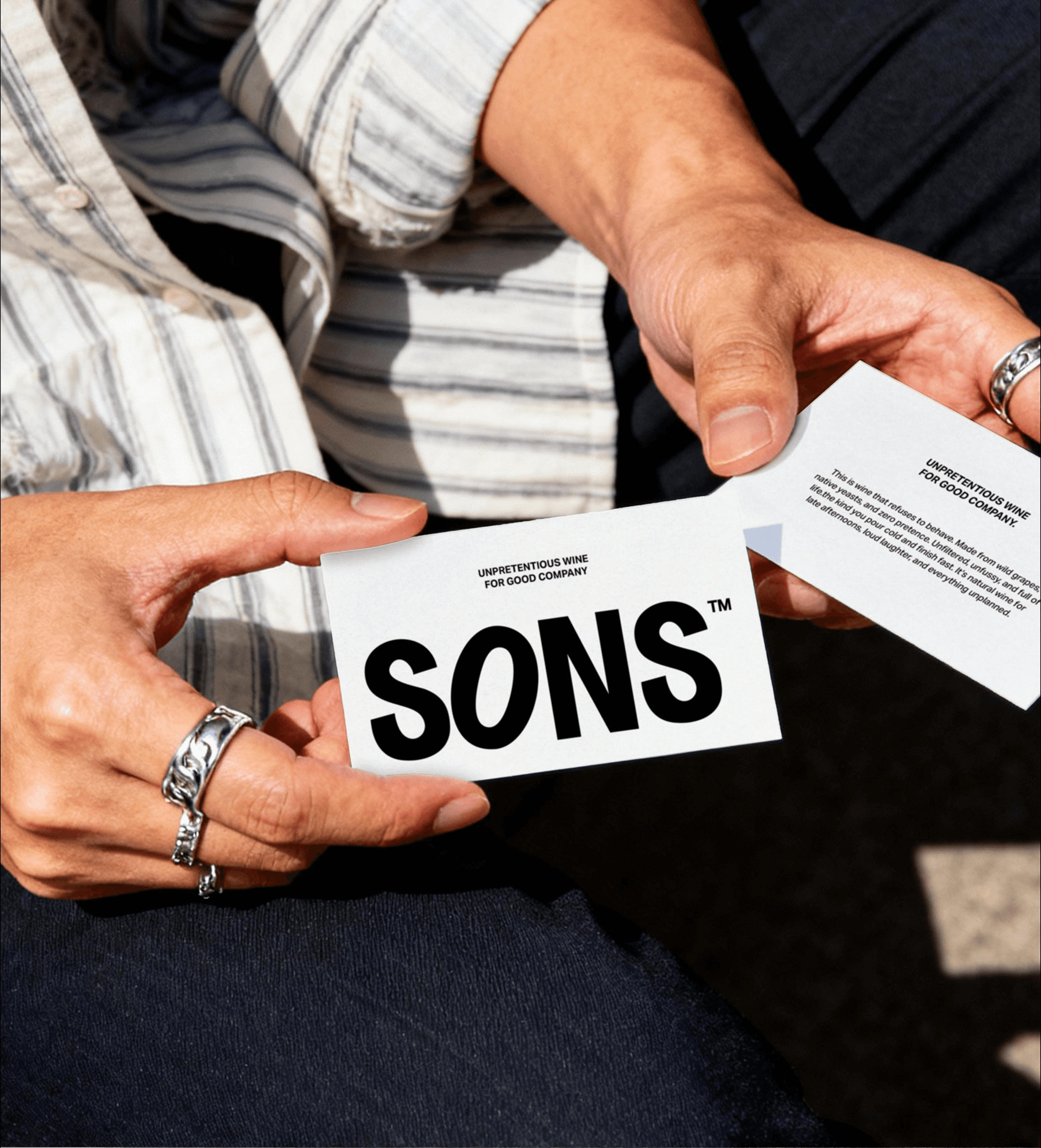
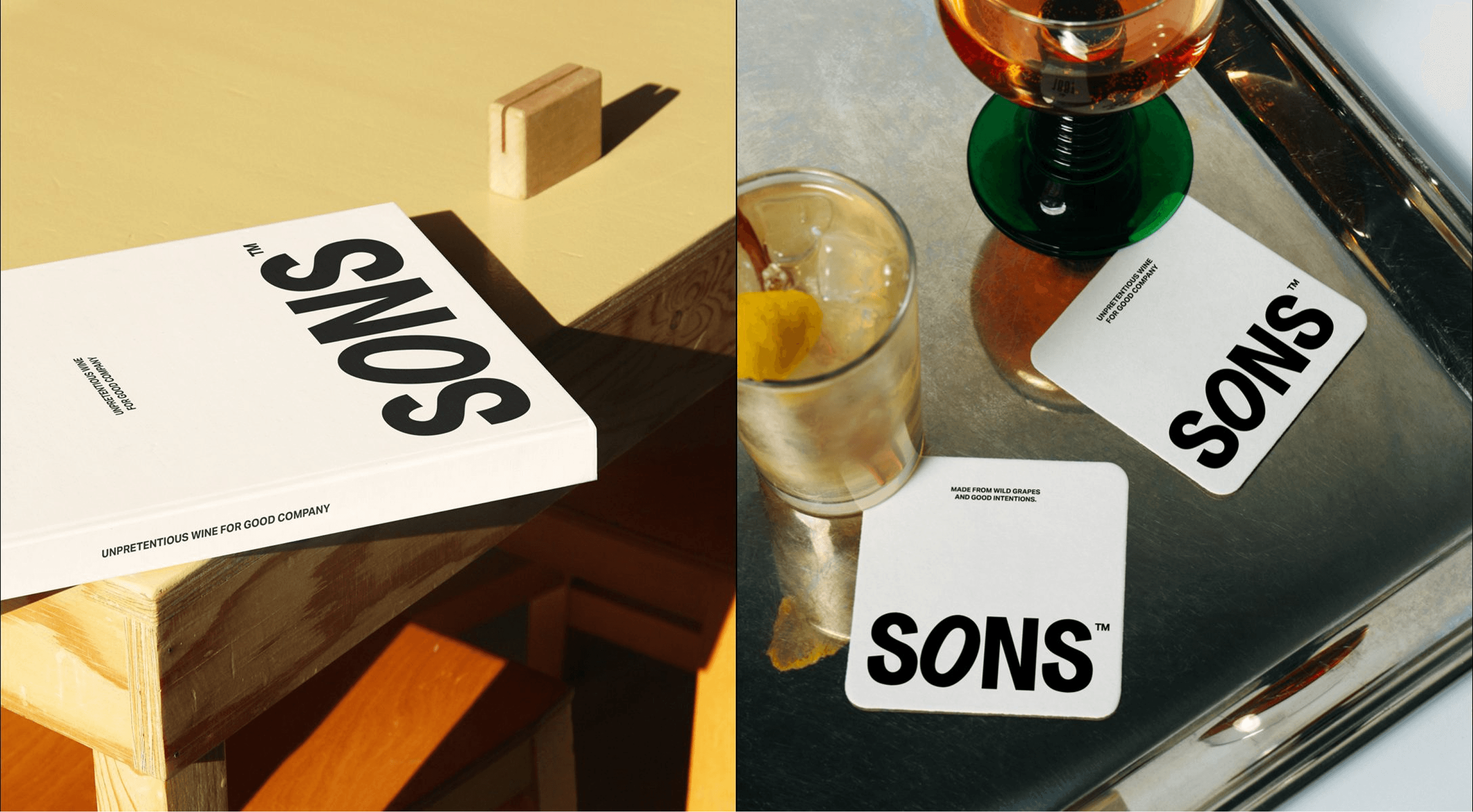
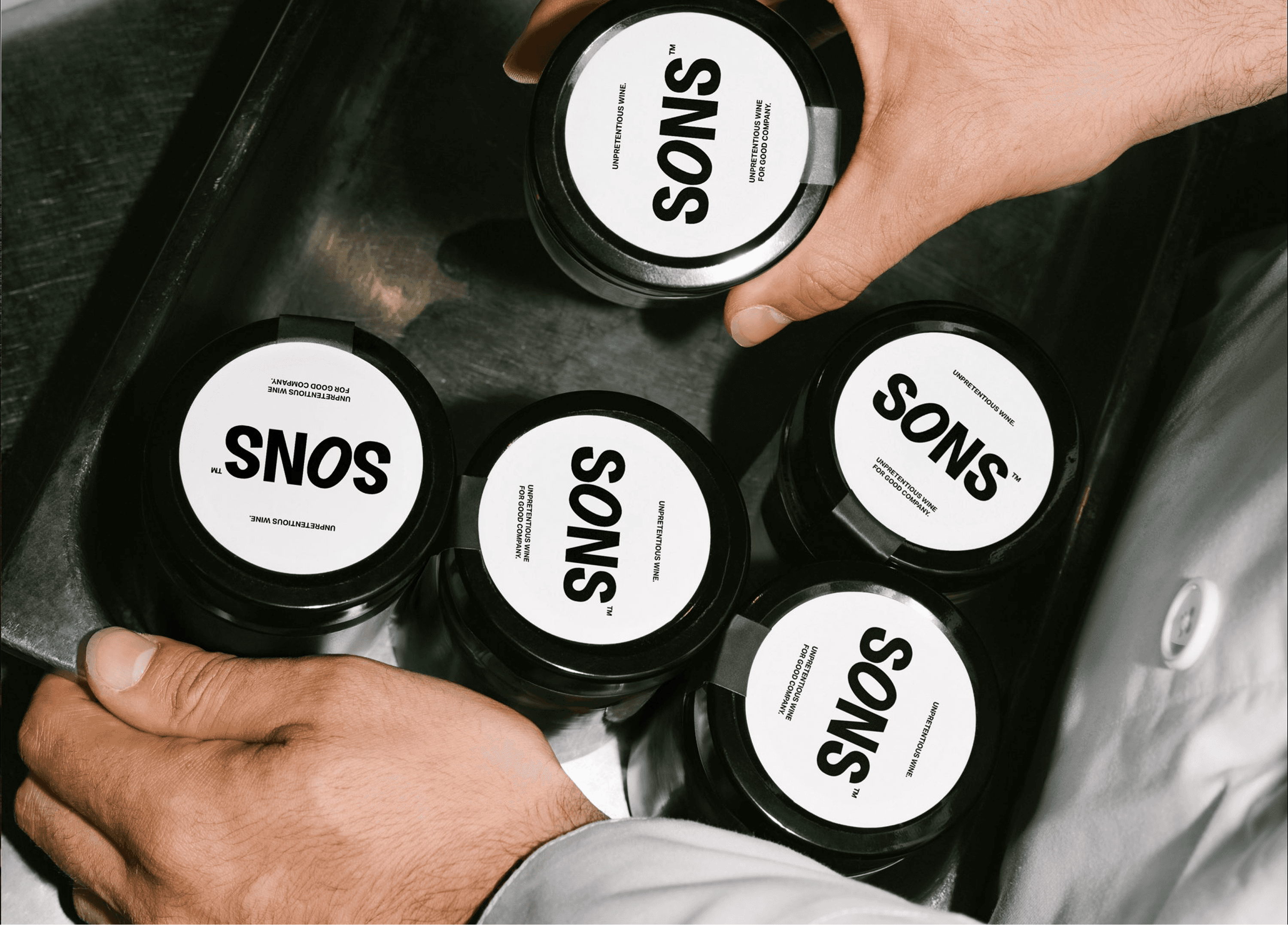
The logomark carries that position. Set in a heavy sans serif, it anchors the brand with clarity and presence, direct and modern and straightforward about it. The typography system follows the same logic, clean and utilitarian and highly legible, holding back so that tone and layout do the expressive work rather than the letterforms themselves.
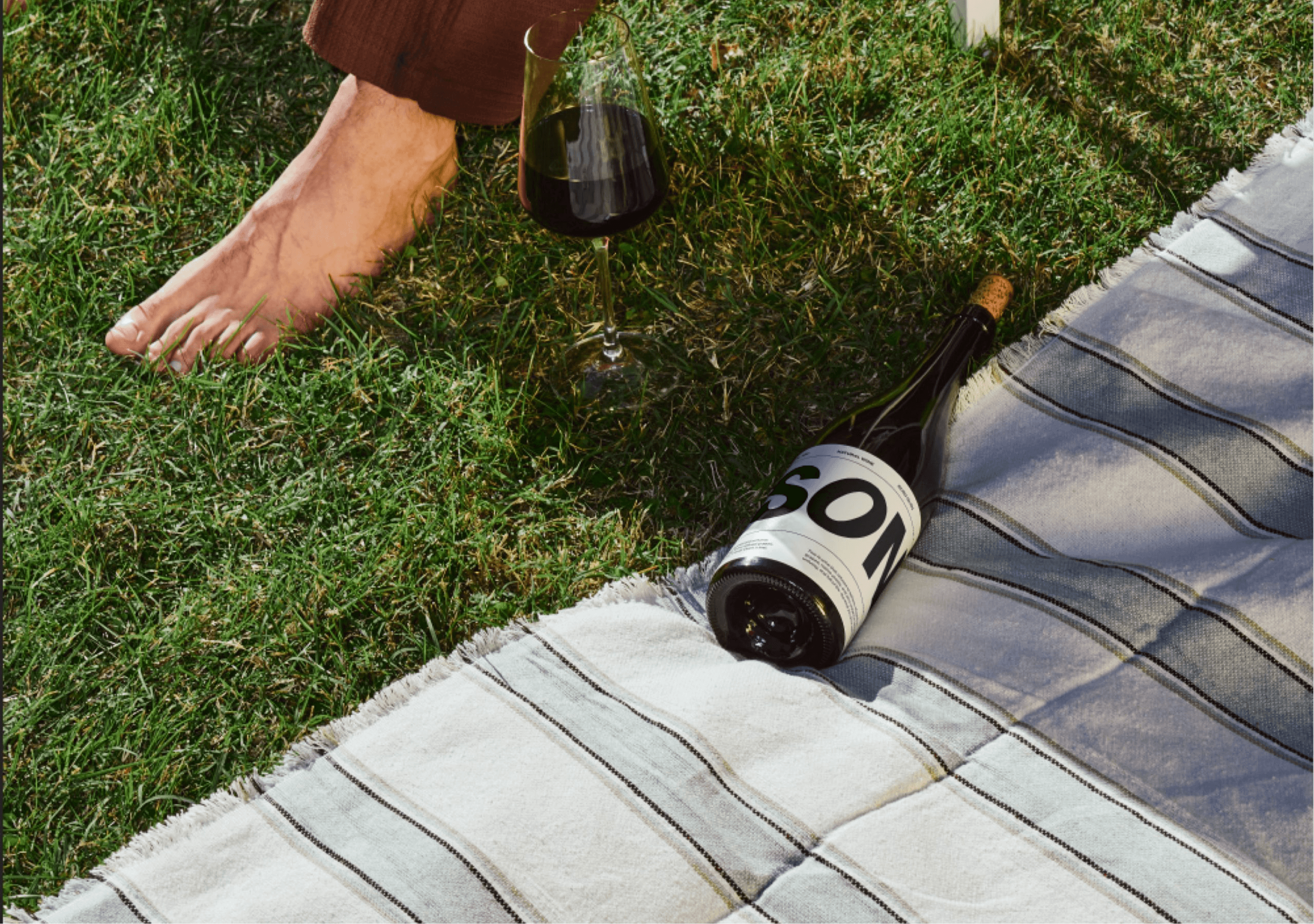
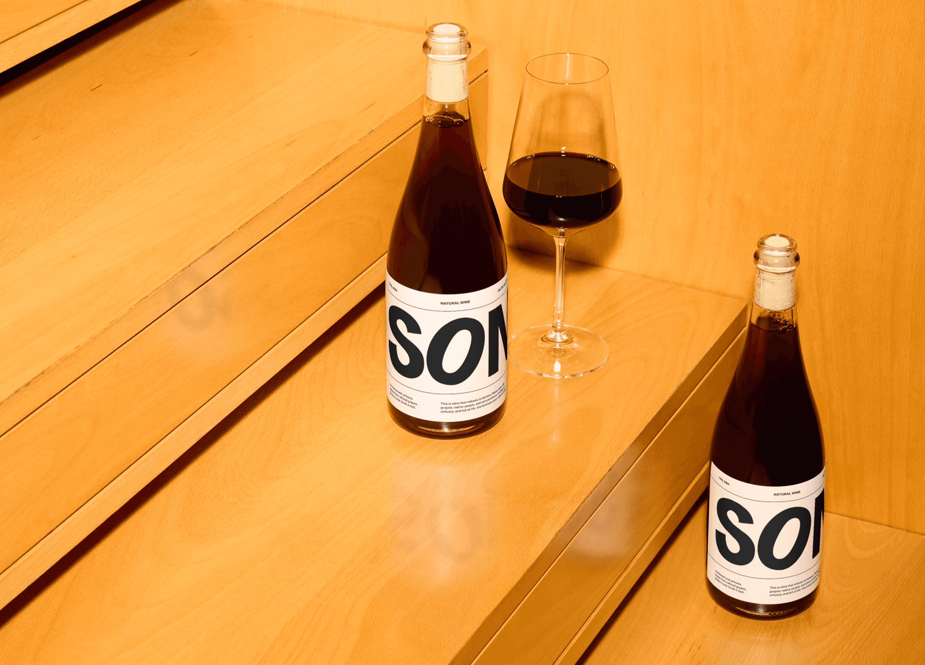
Packaging extends the ethos of honesty and ease. Labels stay minimal, white space is generous, and a strong typographic hierarchy reads as modern British sensibility without announcing it. The art direction works in the same register, built on natural textures, real light and casual compositions. It positions SONS as a brand that feels as effortless as the moments it is made to accompany.
Restraint is the whole argument. SONS says less on the label and trusts that the confidence reads.